variabilitychart
R2026bSyntax
Description
variabilitychart(___,
specifies additional options using one or more name-value arguments. For example, you can
specify the names of the factors or add boxes around the level data for specific
factors.Name=Value)
variabilitychart(
creates the variability chart in the specified parent container.parent,___)
returns
a v = variabilitychart(___)VariabilityChart object. Use v to set properties of
the variability chart after creating it. For a list of properties, see VariabilityChart Properties.
Examples
This example shows how to create a variability chart from categorical factor vectors and a numeric response vector to identify sources of variation in a manufacturing process.
Define data for a component manufacturing process with three operators and two machines. Each operator uses each machine four times.
operator = repelem(categorical(["Op1","Op2","Op3"]),8)'; machine = repmat(categorical(["M1","M2"]),1,12)';
Simulate part thickness measurements with variation due to operator and machine differences.
rng(0) % For reproducibility
thickness = 5 + 0.3*double(operator) + 0.5*double(machine) + 0.2*randn(24,1);Create a variability chart to visualize how thickness varies across operators and machines.
variabilitychart({operator,machine},thickness)
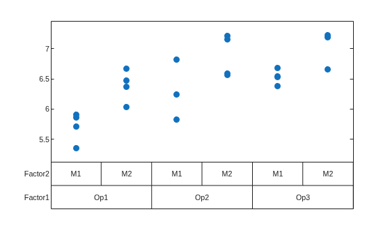
Use the variability chart to observe trends in the data. For example, machine M2 seems to produce thicker components than M1. There also appears to be variation based on who is operating the machine.
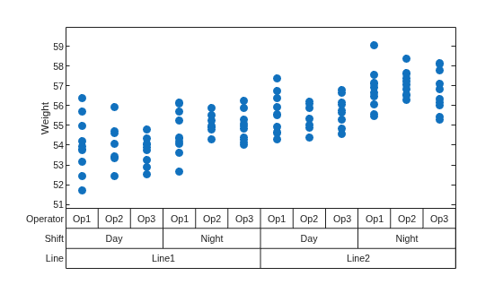
This example shows how to create a variability chart by passing a table and specifying the response variable name.
Construct a table of product weights measured across two production lines, two shifts, and three operators.
rng(0) % For reproducibility Line = repelem(categorical(["Line1","Line2"]),60)'; Shift = repmat(repelem(categorical(["Day","Night"]),30),1,2)'; Operator = repmat(repelem(categorical(["Op1","Op2","Op3"]),10),1,4)'; Weight = 50 + 2*double(Line) + 1.5*double(Shift) + 0.8*randn(120,1); tbl = table(Line,Shift,Operator,Weight);
Create a variability chart for the Weight variable. The function uses the remaining table variables as factors.
variabilitychart(tbl,"Weight")
Add boxes around factor levels and a target line to a variability chart using name-value arguments.
Load the patients data set and store the diastolic blood pressure readings with location and gender factors in a table.
load patients tbl = table(categorical(Location),categorical(Gender),Diastolic, ... VariableNames=["Location","Gender","Diastolic"]);
Create a variability chart with boxes around the first factor and a target line at 80 mmHg representing a clinical threshold.
variabilitychart(tbl,"Diastolic", ... FactorsWithBoxes=1, ... TargetValue=80)
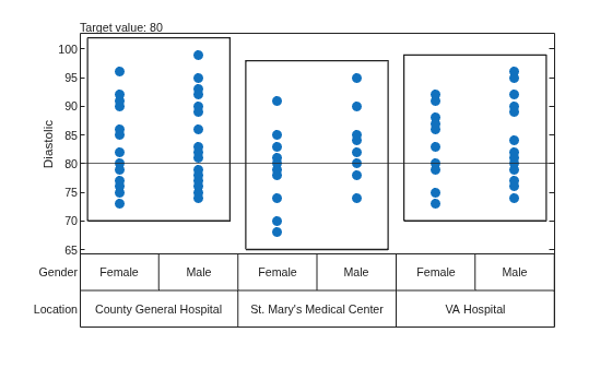
The chart now highlights the grouping structure with boxes around location levels and marks the clinical threshold with a target line at 80 mmHg.
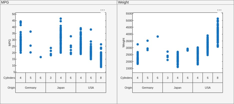
Create variability charts in specific panel containers within a figure to compare how fuel economy and vehicle weight vary across countries of origin and engine sizes.
Load the carbig data set and store the origin, cylinder count, fuel economy, and weight data in a table. Filter to the three most-represented countries and remove rows with missing values.
load carbig tbl = table(categorical(cellstr(Origin)),categorical(Cylinders),MPG,Weight, ... VariableNames=["Origin","Cylinders","MPG","Weight"]); tbl = tbl(ismember(tbl.Origin,["USA","Japan","Germany"]) & ~isnan(tbl.MPG) & ~isnan(tbl.Weight),:);
Create a figure with two panels, then plot a variability chart in each panel by passing the panel as the first argument.
f = figure(Position=[100 100 900 400]); p1 = uipanel(f,Position=[0 0 0.5 1],Title="MPG"); variabilitychart(p1,tbl,"MPG",FactorVariables=["Origin","Cylinders"]) p2 = uipanel(f,Position=[0.5 0 0.5 1],Title="Weight"); variabilitychart(p2,tbl,"Weight",FactorVariables=["Origin","Cylinders"])
Input Arguments
Sample data, specified as a numeric vector.
Data Types: single | double
Factor variables, specified as a numeric vector, logical vector, categorical vector,
string array, cell array of character vectors, or cell array of vectors. Each factor
variable must have the same length as ydata.
Factors are sometimes called grouping variables. The
variabilitychart function groups the observations in
ydata by their factor values. For more information on factors,
see Grouping Variables.
Data Types: single | double | char | string | cell | categorical
Source table containing the sample data and factor variables, specified as a table.
Data Types: table
Table variable containing the sample data, specified using one of the indexing schemes from the following table.
| Indexing Scheme | Examples |
|---|---|
Variable name:
|
|
Variable index:
|
|
Variable type:
|
|
Example: yvar=3
Parent container, specified as a Figure, Panel,
Tab, TiledChartLayout, or
GridLayout object.
Name-Value Arguments
Specify optional pairs of arguments as
Name1=Value1,...,NameN=ValueN, where Name is
the argument name and Value is the corresponding value.
Name-value arguments must appear after other arguments, but the order of the
pairs does not matter.
Example: variabilitychart(ydata,factors,TargetValue=5,FactorsWithBoxes=2)
uses the data in ydata and the factors in factors
to plot a variability chart with boxes around the second factor and a target line at
y = 2.
Note
The VariabilityChart properties listed here are only a subset. For a
complete list, see VariabilityChart Properties.
Factor names, specified as a string array, cell array of character vectors, or
categorical array. FactorNames must have one name for each factor
variable.
The factor names are displayed along the y-axis of the chart in
line with each factors' level names. To remove factor names from the chart, specify an
empty cell array ({}) for FactorNames.
If you pass a table to variabilitychart,
FactorNames is the names of the table variables by default. If
you pass a cell array or vector to variabilitychart,
FactorNames is
{'Factor1','Factor2',...,'Factorn'}, where
n is the number of factors by default.
Example: FactorNames=["F1","F2","F3"]
Data Types: char | string | cell | categorical
Display names of the factor levels, specified as a cell array of vectors. Each
cell in LevelsDisplayNames corresponds to a factor and must
contain a vector with one element for each unique level in that factor. The level
names are displayed in rows by factor along the x-axis.
By default variabilitychart uses the categories found in the
corresponding factor as the display names for the factor levels.
Example: LevelsDisplayNames={["A1","A2","A3"],["B1","B2"]}
Data Types: cell
Indicator to add separators between the factor levels, specified as a positive integer or vector of positive integers. The integer values must be in the range [1,n] where n is the number of factors.
The software adds a vertical grid line separator when the level changes for each
factor specified by FactorsWithSeparators. If the level changes
because of a change to a factor not specified in
FactorsWithSeparators, the software does not add a
separator.
Example: FactorsWithSeparators=3
Data Types: single | double
Indicator to add boxes around the factor levels, specified as a positive integer or vector of positive integers. The integer values must be in the range [1,n] where n is the number of factors.
The software adds a box around the level data for each factor specified by
FactorsWithBoxes.
Example: FactorsWithBoxes=2
Data Types: single | double
Indicator to add mean lines to the factor levels, specified as a positive integer or vector of positive integers. The integer values must be in the range [1,n] where n is the number of factors.
The software adds horizontal lines at the mean value of each level for each factor
specified by FactorsWithMeans.
Example: FactorsWithMeans=1
Data Types: single | double
Indicator to color the factor levels, specified as a positive integer. The integer value must be in the range [1,n] where n is the number of factors. The software sets each of the unique levels in the specified factor to a different color.
Example: FactorWithColors=4
Data Types: single | double
Target value, specified as a numeric scalar. The software adds a horizontal line
at y = and a label to the right of
the y-axis. UseTargetValueTargetValueLabel to customize the
label.
Example: TargetValue=12
Data Types: single | double
Output Arguments
Variability chart, returned as a VariabilityChart object. Use
v to set properties of the variability chart after creating it.
For a list of properties, see VariabilityChart Properties.
More About
A variability chart is a visual tool that shows how data varies across different factors. Use a variability chart to identify where variation originates and understand what drives differences in a process.
Version History
Introduced in R2026b
MATLAB Command
You clicked a link that corresponds to this MATLAB command:
Run the command by entering it in the MATLAB Command Window. Web browsers do not support MATLAB commands.
Select a Web Site
Choose a web site to get translated content where available and see local events and offers. Based on your location, we recommend that you select: .
You can also select a web site from the following list
How to Get Best Site Performance
Select the China site (in Chinese or English) for best site performance. Other MathWorks country sites are not optimized for visits from your location.
Americas
- América Latina (Español)
- Canada (English)
- United States (English)
Europe
- Belgium (English)
- Denmark (English)
- Deutschland (Deutsch)
- España (Español)
- Finland (English)
- France (Français)
- Ireland (English)
- Italia (Italiano)
- Luxembourg (English)
- Netherlands (English)
- Norway (English)
- Österreich (Deutsch)
- Portugal (English)
- Sweden (English)
- Switzerland
- United Kingdom (English)