uibuttongroup
Create button group to manage radio buttons and toggle buttons
Description
bg = uibuttongroup creates a button group in the current figure and
returns the ButtonGroup object. If there is no figure available,
MATLAB® calls the figure function to create one.
bg = uibuttongroup(
creates the button group in the specified parent container. The parent container can be
a figure or a child container of a figure, such as a panel.parent)
bg = uibuttongroup(___,
specifies Name,Value)ButtonGroup properties using one or more name-value
arguments. Use this option with any of the input argument combinations in the previous
syntaxes. For more information, see Name-Value Arguments.
Examples
Create a button group in a UI figure. Add three toggle buttons to the button group. By default, the first button is selected.
fig = uifigure;
bg = uibuttongroup(fig,"Position",[137 113 123 85]);
b1 = uitogglebutton(bg,"Text","Button 1","Position",[10 50 100 22]);
b2 = uitogglebutton(bg,"Text","Button 2","Position",[10 28 100 22]);
b3 = uitogglebutton(bg,"Text","Button 3","Position",[10 6 100 22]);
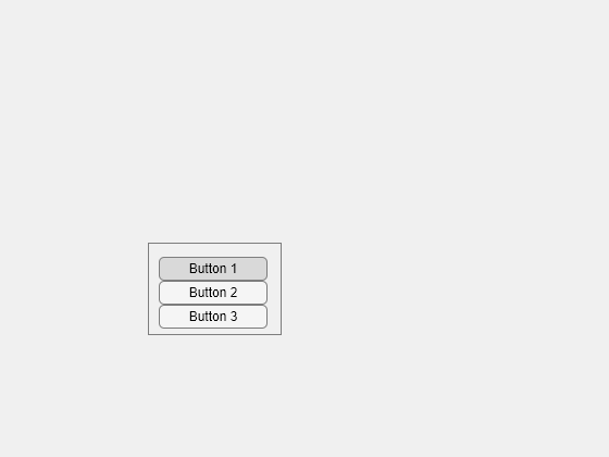
Click Button 3. The button group manages the toggle button selection by showing the first button as deselected and the third button as selected.

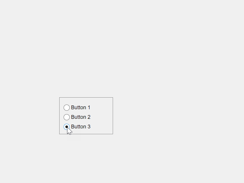
Create a button group in a UI figure. Add three radio buttons to the button group. By default, the first button is selected.
fig = uifigure;
bg = uibuttongroup(fig,"Position",[137 113 123 85]);
b1 = uiradiobutton(bg,"Text","Button 1","Position",[10 50 100 22]);
b2 = uiradiobutton(bg,"Text","Button 2","Position",[10 28 100 22]);
b3 = uiradiobutton(bg,"Text","Button 3","Position",[10 6 100 22]);

Click Button 3. The button group manages the radio button selection by showing the first button as deselected and the third button as selected.
Create a button group in a UI figure. Add six toggle buttons, with the first three lying outside the upper border of the button group.
fig = uifigure;
bg = uibuttongroup(fig,"Position",[20 20 196 135]);
tb1 = uitogglebutton(bg,"Position",[11 165 140 22],"Text","One");
tb2 = uitogglebutton(bg,"Position",[11 140 140 22],"Text","Two");
tb3 = uitogglebutton(bg,"Position",[11 115 140 22],"Text","Three");
tb4 = uitogglebutton(bg,"Position",[11 90 140 22],"Text","Four");
tb5 = uitogglebutton(bg,"Position",[11 65 140 22],"Text","Five");
tb6 = uitogglebutton(bg,"Position",[11 40 140 22],"Text","Six");

Enable scrolling by setting the Scrollable property of the button group to 'on'. By default, the scroll box displays at the top.
bg.Scrollable = 'on';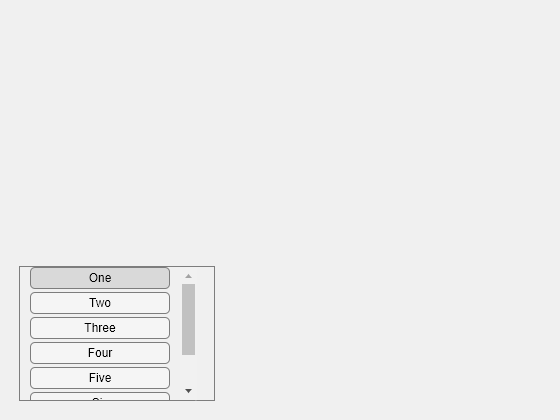
Create an app that shows the previous and current button selections in the MATLAB Command Window when the user selects a different radio button in a button group.
In a file named buttonGroupApp.m, write a function that implements the app:
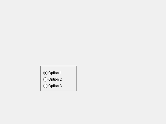
Create a UI figure with a button group that contains three radio buttons.
Write a callback function named
displaySelectionfor the button group that displays the text of the previously and currently selected radio buttons, and assign the function to theSelectionChangedFcncallback property. For more information about callbacks, see Create Callbacks for Apps Created Programmatically.
function buttonGroupApp
fig = uifigure;
bg = uibuttongroup(fig, ...
    "SelectionChangedFcn",@displaySelection, ...
    "Position",[137 113 123 85]);
r1 = uiradiobutton(bg, ...
    "Text","Option 1", ...
    "Position",[10 50 100 22]);
r2 = uiradiobutton(bg, ...
    "Text","Option 2", ...
    "Position",[10 28 100 22]);
r3 = uiradiobutton(bg, ...
    "Text","Option 3", ...
    "Position",[10 6 100 22]);

function displaySelection(src,event)
disp("Previous: " + event.OldValue.Text);
disp("Current: " + event.NewValue.Text);
end
end
Run the buttonGroupApp function. Change the button selection. The previous and current selection displays in the Command Window.
buttonGroupApp
Input Arguments
Parent container, specified as a Figure
object or one of its child containers: Tab,
Panel, ButtonGroup, or GridLayout.
Name-Value Arguments
Specify optional pairs of arguments as
Name1=Value1,...,NameN=ValueN, where Name is
the argument name and Value is the corresponding value.
Name-value arguments must appear after other arguments, but the order of the
pairs does not matter.
Example: uibuttongroup(Title="Options") specifies that the button
group title is Options.
Before R2021a, use commas to separate each name and value, and enclose
Name in quotes.
Example: uibuttongroup("Title","Options") specifies that the button
group title is Options.
Note
The properties listed here are a subset of the available properties. For the full
list, see ButtonGroup.
Title, specified as a character vector, string scalar, or categorical array. If you specify this property as a categorical array, MATLAB displays only the first element in the array.
MATLAB does not interpret a vertical slash ('|') character as
a line break, it displays as a vertical slash in the title.
If you want to specify a Unicode® character, pass the Unicode decimal
code to the char function.
For example, ['Multiples of ' char(960)] displays
as Multiples of π.
Background color, specified as an RGB triplet, a hexadecimal color code, or one of the color options listed in the table.
RGB triplets and hexadecimal color codes are useful for specifying custom colors.
An RGB triplet is a three-element row vector whose elements specify the intensities of the red, green, and blue components of the color. The intensities must be in the range
[0,1]; for example,[0.4 0.6 0.7].A hexadecimal color code is a character vector or a string scalar that starts with a hash symbol (
#) followed by three or six hexadecimal digits, which can range from0toF. The values are not case sensitive. Thus, the color codes"#FF8800","#ff8800","#F80", and"#f80"are equivalent.
Alternatively, you can specify some common colors by name. This table lists the named color options, the equivalent RGB triplets, and hexadecimal color codes.
| Color Name | Short Name | RGB Triplet | Hexadecimal Color Code | Appearance |
|---|---|---|---|---|
"red" | "r" | [1 0 0] | "#FF0000" |
|
"green" | "g" | [0 1 0] | "#00FF00" |
|
"blue" | "b" | [0 0 1] | "#0000FF" |
|
"cyan"
| "c" | [0 1 1] | "#00FFFF" |
|
"magenta" | "m" | [1 0 1] | "#FF00FF" |
|
"yellow" | "y" | [1 1 0] | "#FFFF00" |
|
"black" | "k" | [0 0 0] | "#000000" |
|
"white" | "w" | [1 1 1] | "#FFFFFF" |
|
This table lists the default color palettes for plots in the light and dark themes.
| Palette | Palette Colors |
|---|---|
Before R2025a: Most plots use these colors by default. |
|
|
|
You can get the RGB triplets and hexadecimal color codes for these palettes using the orderedcolors and rgb2hex functions. For example, get the RGB triplets for the "gem" palette and convert them to hexadecimal color codes.
RGB = orderedcolors("gem");
H = rgb2hex(RGB);
Before R2023b: Get the RGB triplets using RGB =
get(groot,"FactoryAxesColorOrder").
Before R2024a: Get the hexadecimal color codes using H =
compose("#%02X%02X%02X",round(RGB*255)).
Currently selected radio button or toggle button, specified as a RadioButton, ToggleButton, or UIControl object.
Query the value of this property to determine which button is currently
selected within the button group. Set the value of this property to change the
currently selected button. When you change the selection using this property,
MATLAB adjusts the Value property for the other
buttons within the button group accordingly.
For example, suppose that your button group contains three radio buttons and
you set the SelectedObject property to
radiobutton3. MATLAB sets the Value property for each child
RadioButton as follows:
radiobutton1.Value = false;radiobutton2.Value = false;radiobutton3.Value = true;
In other words, setting the SelectedObject property has
the same effect as setting the Value property of the
buttons in the button group.
Selection changed callback, specified as one of these values:
A function handle
Cell array in which the first element is a function handle and subsequent elements are the arguments to pass to the callback function
String scalar or character vector containing a valid MATLAB command or function, which is evaluated in the base workspace (not recommended)
This callback executes when the user selects a different button within the
button group in the app. It does not execute if a radio or toggle button
Value property changes programmatically.
This callback function can access specific information about the user’s
interaction with the buttons. MATLAB passes this information in a SelectionChangedData object as the second argument to your
callback function. In App Designer, the argument is called
event. You can query the object properties using dot
notation. For example, event.NewValue returns the currently
selected button. The SelectionChangedData
object is not available to callback functions specified as character
vectors.
The following table lists the properties of the SelectionChangedData object.
Property | Description |
|---|---|
OldValue | Previously selected button |
NewValue | Currently selected button |
Source | Component that executes the callback |
EventName |
|
For more information about writing callbacks, see Callbacks in App Designer.
Location and size of the button group, including borders and title, specified as a vector of
the form [left bottom width height]. This table describes each
element in the vector.
| Element | Description |
|---|---|
left | Distance from the inner left edge of the parent container to the outer left edge of the button group |
bottom | Distance from the inner bottom edge of the parent container to the outer bottom edge of the button group |
width | Distance between the right and left outer edges of the button group |
height | Distance between the top and bottom outer edges of the button group |
All measurements are in units specified by the
Units property.
The Position values are relative to the
drawable area of the parent container. The drawable area is the area
inside the borders of the container and does not include the area occupied by decorations such
as a menu bar or title.
Note
If the button group is parented to a grid layout manager, the value of the
Position property is not immediately updated. To use the
Position value to resize the button group children relative
to the button group size, use a SizeChangedFcn callback.
Units of measurement, specified as one of the values in this table.
| Units Value | Description |
|---|---|
'pixels' (default in uifigure-based apps) | On Windows® and Macintosh systems, the size of a pixel is 1/96th of an inch. This size is independent of your system resolution. On Linux® systems, the size of a pixel is determined by your system resolution. |
'normalized' (default in figure-based apps) | These units are normalized with respect to the parent container. The lower-left corner of the container maps to |
'inches' | Inches. |
'centimeters' | Centimeters. |
'points' | Points. One point equals 1/72nd of an inch. |
'characters' | These units are based on the default uicontrol font of the graphics root object:
To access the default uicontrol font, use |
The recommended value is 'pixels', because most MATLAB app building functionality measures distances in pixels. You can create an
object that rescales based on the size of the parent container by parenting the object
to a grid layout manager created using the uigridlayout function. For more information, see Lay Out Apps Programmatically.
Tips
A button group can contain any UI component type, but it manages the selection of only radio buttons and toggle buttons.
To make your program respond when the app user selects a radio button or toggle button that is inside a button group, define a
SelectionChangedFcncallback function for the button group. You cannot define callbacks for the individual buttons.To determine which radio button or toggle button is selected, query the
SelectedObjectproperty of the button group. You can execute this query anywhere in your code.If you set the
Visibleproperty of a button group object to'off', then any child objects it contains (buttons, other button groups, and so on) become invisible along with the parent button group. However, theVisibleproperty value of each child object remains unaffected.
Version History
Introduced before R2006aButton groups created in apps created using the figure function
have an updated appearance. Because of this update, certain title and border options
have changed.
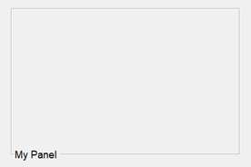
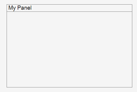
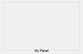
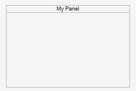
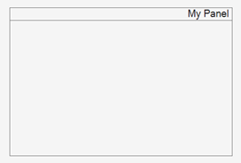
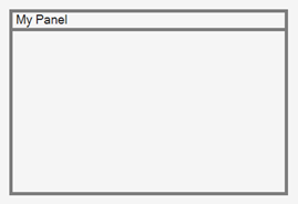
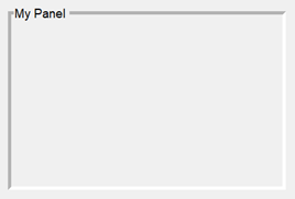
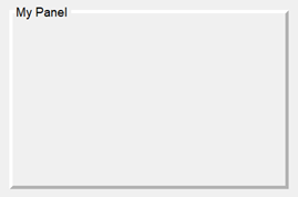
TitlePosition PropertyButton group titles can appear only at the top of button groups. As a result,
these TitlePosition values have changes in behavior.
| Value | R2024b and Earlier | Starting in R2025a | Recommended Value |
|---|---|---|---|
'leftbottom' |
|
| Update your code to use 'lefttop' instead
of'leftbottom' to reflect the button group title
position. |
'centerbottom' |
|
| Update your code to use 'centertop' instead
of'centerbottom' to reflect the button group title
position. |
'rightbottom' |
|
| Update your code to use 'righttop' instead
of'rightbottom' to reflect the button group title
position. |
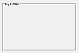
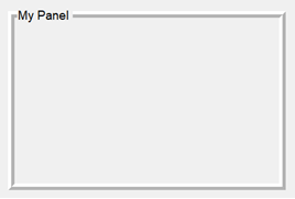
BorderType PropertyVisible button group borders always appear as a line. As a result, some
BorderType values have changes in behavior. Specifying
BorderType as any of the values in the table causes a
warning. Additionally, the default BorderType value has changed
from 'etchedin' to 'line'.
| Value | R2024b | R2025a | Recommended Value |
|---|---|---|---|
'etchedin' |
|
| Update your code to use 'line' instead of
'etchedin' to reflect the button group border
type. |
'etchedout' |
|
| Update your code to use 'line' instead of
'etchedout' to reflect the button group border
type. |
'beveledin' |
|
| Update your code to use 'line' instead of
'beveledin' to reflect the button group border
type. |
'beveledout' |
|
| Update your code to use 'line' instead of
'beveledout' to reflect the button group border
type. |
ShadowColor PropertyAs a result of the changes to the BorderType property, the
ShadowColor property has no effect and warns if you set it.
To specify the border color of a button group, use the
BorderColor property instead.
The ShadowColor property no longer appears in the list
returned by calling the get function on a
ButtonGroup object.
ButtonGroup objects in apps created using the
figure function include these additional properties:
TooltipScrollableAutoResizeChildrenLayoutEnable
Previously, these properties were available only for ButtonGroup
objects in apps created using the uifigure function.
You can change the border color of a button group in both
uifigure-based and figure-based apps by
using the BorderColor property.
The BorderColor property is recommended over the
HighlightColor property, which is supported only in
figure-based apps. However, there are no plans to remove support
for HighlightColor.
In apps created in App Designer and using the uifigure function,
use the BorderWidth property to change the border width of the
button group.
To control whether a button group responds to user interaction, use the
Enable property. When the Enable property
is set to 'on', you can interact with the button group and with UI
components within it as long as they are enabled. When the Enable
property is set to 'off', you cannot interact with the button group
or its content.
The Enable property is supported only for button groups in App
Designer and uifigure-based apps.
MATLAB Command
You clicked a link that corresponds to this MATLAB command:
Run the command by entering it in the MATLAB Command Window. Web browsers do not support MATLAB commands.
Select a Web Site
Choose a web site to get translated content where available and see local events and offers. Based on your location, we recommend that you select: .
You can also select a web site from the following list
How to Get Best Site Performance
Select the China site (in Chinese or English) for best site performance. Other MathWorks country sites are not optimized for visits from your location.
Americas
- América Latina (Español)
- Canada (English)
- United States (English)
Europe
- Belgium (English)
- Denmark (English)
- Deutschland (Deutsch)
- España (Español)
- Finland (English)
- France (Français)
- Ireland (English)
- Italia (Italiano)
- Luxembourg (English)
- Netherlands (English)
- Norway (English)
- Österreich (Deutsch)
- Portugal (English)
- Sweden (English)
- Switzerland
- United Kingdom (English)
