Add Title and Axis Labels to Chart
This example shows how to add a title and axis labels to a chart by using the title, xlabel, and ylabel functions. It also shows how to customize the appearance of the axes text by changing the font size.
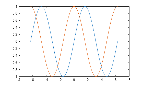
Create Simple Line Plot
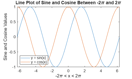
Create x as 100 linearly spaced values between and . Create y1 and y2 as sine and cosine values of x. Plot both sets of data.
x = linspace(-2*pi,2*pi,100);
y1 = sin(x);
y2 = cos(x);
figure
plot(x,y1,x,y2)
Add Title
Add a title to the chart by using the title function. To display the Greek symbol , use the TeX markup, \pi.
title('Line Plot of Sine and Cosine Between -2\pi and 2\pi')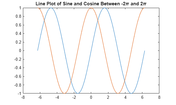
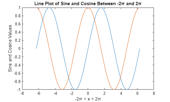
Add Axis Labels
Add axis labels to the chart by using the xlabel and ylabel functions.
xlabel('-2\pi < x < 2\pi')
ylabel('Sine and Cosine Values')
Add Legend
Add a legend to the graph that identifies each data set using the legend function. Specify the legend descriptions in the order that you plot the lines. Optionally, specify the legend location using one of the eight cardinal or intercardinal directions, in this case, 'southwest'.
legend({'y = sin(x)','y = cos(x)'},'Location','southwest')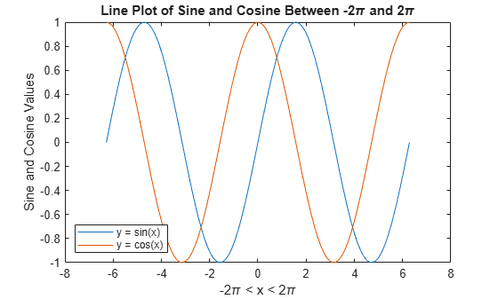
Change Font Size
Axes objects have properties that you can use to customize the appearance of the axes. For example, the FontSize property controls the font size of the title, labels, and legend.
Access the current Axes object using the gca function. Then use dot notation to set the FontSize property.
ax = gca;
ax.FontSize = 13;
Alternatively, starting in R2022a, you can change the font size of the axes text by using the fontsize function.
Title with Variable Value
Include a variable value in the title text by using the num2str function to convert the value to text. You can use a similar approach to add variable values to axis labels or legend entries.
Add a title with the value of .
k = sin(pi/2);
title(['sin(\pi/2) = ' num2str(k)])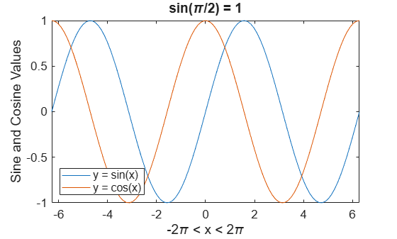
See Also
title | xlabel | ylabel | legend | linspace | fontsize