Simulation and Prediction in the App
How to Plot Simulated and Predicted Model Output
To create a model output plot for parametric linear and nonlinear models in the System Identification app, select the Model output check box in the Model Views area. By default, this operation estimates the initial states from the data and plots the output of selected models for comparison.
To include or exclude a model on the plot, click the corresponding model icon in the System Identification app. Active models display a thick line inside the Model Board icon.
To learn how to interpret the model output plot, see Interpret the Model Output Plot.
To change plot settings, see Change Model Output Plot Settings.
For general information about creating and working with plots, see Working with Plots.
Interpret the Model Output Plot
The following figure shows a sample Model Output plot, created in the System Identification app.
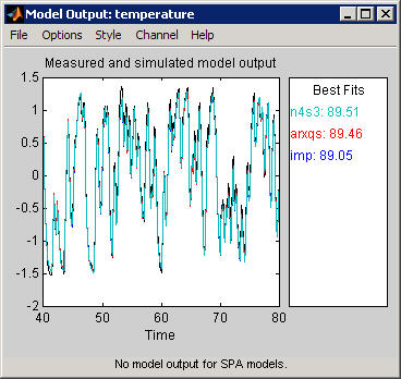
The model output plot shows different information depending on the domain of the input-output validation data, as follows:
For time-domain validation data, the plot shows simulated or predicted model output.
For frequency-domain data, the plot shows the amplitude of the model response to the frequency-domain input signal. The model response is equal to the product of the Fourier transform of the input and the model frequency function.
For frequency-response data, the plot shows the amplitude of the model frequency response.
For linear models, you can estimate a model using time-domain data, and then validate the model using frequency domain data. For nonlinear models, you can only use time-domain data for both estimation and validation.
The right side of the plot displays the percentage of the output that the model reproduces (Best Fit), computed using the following equation:
In this equation, y is the measured output, is the simulated or predicted model output, and is the mean of y. 100% corresponds to a perfect fit, and 0% indicates that the fit is no better than guessing the output to be a constant ().
Because of the definition of Best Fit, it is possible for this value to be negative. A negative best fit is worse than 0% and can occur for the following reasons:
The estimation algorithm failed to converge.
The model was not estimated by minimizing . Best Fit can be negative when you minimized 1-step-ahead prediction during the estimation, but validate using the simulated output .
The validation data set was not preprocessed in the same way as the estimation data set.
Change Model Output Plot Settings
The following table summarizes the Model Output plot settings.
Model Output Plot Settings
| Action | Command |
|---|---|
|
Display confidence intervals. Note Confidence intervals are only available for simulated model output of linear models. Confidence internal are not available for nonlinear ARX and Hammerstein-Wiener models. |
|
|
Change between simulated output or predicted output. Note Prediction is only available for time-domain validation data. |
|
|
Display the actual output values (Signal plot), or the difference between model output and measured output (Error plot). | Select Options > Signal plot or Options > Error plot. |
|
(Time-domain validation data only) |
Select Options > Customized time span for fit and enter the minimum and maximum time values. For example: [1 20] |
|
(Multiple-output system only) | Select the output by name in the Channel menu. |
Definition: Confidence Interval
The confidence interval corresponds to the range of output values with a specific probability of being the actual output of the system. The toolbox uses the estimated uncertainty in the model parameters to calculate confidence intervals and assumes the estimates have a Gaussian distribution.
For example, for a 95% confidence interval, the region around the nominal curve represents the range of values that have a 95% probability of being the true system response. You can specify the confidence interval as a probability (between 0 and 1) or as the number of standard deviations of a Gaussian distribution. For example, a probability of 0.99 (99%) corresponds to 2.58 standard deviations.
Note
The calculation of the confidence interval assumes that the model sufficiently describes the system dynamics and the model residuals pass independence tests.
In the app, you can display a confidence interval on the plot to gain insight into the quality of a linear model. To learn how to show or hide confidence interval, see Change Model Output Plot Settings.