
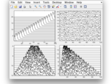
Box and whiskers plot (without statistics toolbox)
Creates nice boxplots from data. You don't need a toolbox. Simple yet fully featured.
array 'T' for a legend. You can add the legend as legend(T)T = bplot(D,x) will plot the boxplot of data D above the 'x' value xT = bplot(D,y,'horiz') will plot a horizontal boxplot at the 'y' value of yT
- 11.8K (All time)
- 7 (Last 30 days)
- 4.7 / 5
- Community
-
16 Sep 2015
Stacked line plots from a matrix or vectors
) contained in the rows of an input 2-D matrix. Each wave has a designated row on the plot. Data may also be specified as vectors X, Y, and Z. The plot is similar to a cascade or waterfall plot.
- 2K (All time)
- 2 (Last 30 days)
- 5.0 / 5
- Community
-
11 Aug 2016

Quantile-quantile plot with patch option
NOTE: this function is now available from the IoSR Matlab Toolbox as iosr.statistics.qqPlot. ------------------------- qq_plot(y) displays a quantile-quantile plot of the sample quantiles of y versus
- 900 (All time)
- 2 (Last 30 days)
- 5.0 / 5
- Community
-
11 Aug 2016
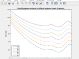
ISO 226:2003 Normal equal-loudness-level contours
Return sound pressure levels of pure tone frequencies at specified loudness level(s).
standard reference frequencies for SPL calculations. Example % Plot equal-loudness contours between 20 and 80 phon % Calculate SPLs phons = 20:10:80; [spl,f] = iso226(phons,[],true); % plot
- 1.2K (All time)
- 1 (Last 30 days)
- 5.0 / 5
- Community
-
11 Aug 2016
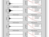
Impulse response acoustic information calculator
Calculate RT, DRR, Cte, and EDT for impulse response file
an audio file or the name of an audio file on the Matlab search path. The file can be of any format supported by the AUDIOREAD function, and have any number of channels; estimates (and plots
- 4.4K (All time)
- 6 (Last 30 days)
- 5.0 / 5
- Community
-
11 Aug 2016

- 3K (All time)
- 2 (Last 30 days)
- 5.0 / 5
- Community
-
11 Aug 2016
Calculate subplot positions by specifying figure margins and axis scaling.
subfigrid(nrows,ncols,offset,scale)The spacing of axes using the subplot command can be quite large, and manipulating axis positions after plotting can be tricky. For publication quality graphics, it is better to specify the subplot
- 985 (All time)
- 1 (Last 30 days)
- 5.0 / 5
- Community
-
11 Aug 2016

- 3.4K (All time)
- 2 (Last 30 days)
- 5.0 / 5
- Community
-
11 Aug 2016

Check whether mex file is compiled for system
Check if mex file is compiled for the OS or if the source was modified since it was compiled.
- 1.2K (All time)
- 1 (Last 30 days)
- 5.0 / 5
- Community
-
11 Aug 2016
- 806 (All time)
- 1 (Last 30 days)
- 5.0 / 5
- Community
-
11 Aug 2016
- 3.2K (All time)
- 1 (Last 30 days)
- 4.9 / 5
- Community
-
11 Aug 2016

Shaded Plots and Statistical Distribution Visualizations
Create pretty shaded plots and plots to visualize the statistical distribution of data.
plot. plot_distribution may be used to visualize the line plot's mean and standard deviation, while plot_distribution may be used to visualize non-Gaussian statistics of the line plot, e.g. the median
- 2.6K (All time)
- 4 (Last 30 days)
- 4.9 / 5
- Community
-
27 Oct 2018

Draw a box plot with various display options
NOTE: this function is now available from the IoSR Matlab Toolbox as iosr.statistics.boxPlot.-------------------------Alternative box plot function for Matlab with many options. These options include
- 10.9K (All time)
- 8 (Last 30 days)
- 4.7 / 5
- Community
-
28 Jun 2017

Quantiles of a sample via various methods
NOTE: this function is now available from the IoSR Matlab Toolbox as iosr.statistics.quantile. ------------------------- This function calculates quantiles and weighted quantiles for vectors
- 1.6K (All time)
- 1 (Last 30 days)
- 4.7 / 5
- Community
-
11 Aug 2016

Histogram plotting and displaying statistical parameters of an Image
Simple code for Histogram plotting and displaying statistical parameters of a gray Image
- 525 (All time)
- 1 (Last 30 days)
- 5.0 / 5
- Community
-
3 Oct 2013

simple box whiskers plot (for those who don't have the statistics toolbox)
box whiskers plot, adjustable size and line thickness
* If you have the statistics toolbox, please don't use this one. * If you are not so lucky, come on and download it freely. This is a very simple version but better than none. * If you have time to
- 4.1K (All time)
- 3 (Last 30 days)
- 5.0 / 5
- Community
-
24 May 2007
PeterRochford/SkillMetricsToolbox
A collection of functions for calculating the skill of model predictions against observations.
- 5.9K (All time)
- 17 (Last 30 days)
- 4.9 / 5
- Community
-
20 Mar 2024

Calculate the long-term average spectrum of a signal
Specifies the dimension of operation (defaults to the first non-singleton dimension). 'graph' : {false} | true Choose whether to plot a graph of the LTAS. 'hop' : {NFFT/2} | scalar
- 1.1K (All time)
- 4 (Last 30 days)
- 4.3 / 5
- Community
-
11 Aug 2016
- 2.2K (All time)
- 1 (Last 30 days)
- 4.0 / 5
- Community
-
20 Jan 2006

Violin Plots for plotting multiple distributions (distributionPlot.m)
Function for plotting multiple histograms side-by-side in 2D - better than boxplot.
The zip-file contains the following files for visualizing distributions:- distributionPlot.m: main function that allows creating violin plots - myHistogram.m: generate histograms with 'ideal' bin
- 14.8K (All time)
- 14 (Last 30 days)
- 5.0 / 5
- Community
-
11 Feb 2017
- 2.5K (All time)
- 2 (Last 30 days)
- 4.0 / 5
- Community
-
11 Aug 2016
- 2.8K (All time)
- 3 (Last 30 days)
- 4.4 / 5
- Community
-
15 Mar 2023

Manhattan Plots for visualisation of GWAS results
A function for plotting a Manhattan Plot in MATLAB directly from a text file of GWAS statistics from PLINK, BOLT-LMM or SAIGE
This function takes the output of a PLINK 1.7 assoc command, a BOLT-LMM or SAIGE association test, produces a publication-ready Manhattan Plot, and saves the result as a .fig for manual tweaking and
- 202 (All time)
- 1 (Last 30 days)
- 5.0 / 5
- Community
-
27 Jun 2019

SIGLINE plots a line of statistical significance on the current axis
SIGLINE plots a line of statistical significance on the current axis sigline(xs) plots a significance line between the value in the 2D vector xs along the x-coordinate. sigline(xs,lbl) places a
- 2.4K (All time)
- 2 (Last 30 days)
- 5.0 / 5
- Community
-
24 Jul 2018

- 1.8K (All time)
- 3 (Last 30 days)
- 3.8 / 5
- Community
-
4 May 2018
Statistical analysis of I & Q components of PolSAR Imagery
Class based Correlation Plots and KLD values for I and Q components.
Generates scatter plots of correlation between inphase and quadrature phase components in POlSAR imagery and computes the Kullback Leiber Divergence between them.
- 488 (All time)
- 1 (Last 30 days)
- 5.0 / 5
- Community
-
15 Jul 2015
- 1.1K (All time)
- 7 (Last 30 days)
- 4.5 / 5
- Community
-
14 Aug 2023
- 955 (All time)
- 4 (Last 30 days)
- -- / 5
- Community
-
14 Apr 2015
- 591 (All time)
- 1 (Last 30 days)
- -- / 5
- Community
-
11 Aug 2016

- 943 (All time)
- 2 (Last 30 days)
- -- / 5
- Community
-
11 Aug 2016
- 296 (All time)
- 2 (Last 30 days)
- -- / 5
- Community
-
11 Aug 2016
- 1.3K (All time)
- 1 (Last 30 days)
- -- / 5
- Community
-
11 Aug 2016

Calculate and apply time-frequency masks via STFT
Calculate ideal time-frequency masks and apply time-frequency masks to signals via STFT
- 967 (All time)
- 3 (Last 30 days)
- -- / 5
- Community
-
11 Aug 2016

- 949 (All time)
- 1 (Last 30 days)
- -- / 5
- Community
-
11 Aug 2016

- 174 (All time)
- 4 (Last 30 days)
- -- / 5
- Community
-
4 Jul 2024

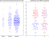
Identify Malicious Labelers among Crowdsourcing Participants
Evaluating Crowdsourcing Participants in the Absence of Ground-Truth
and W respectively.(b) Resulting probabilities [0, 1] from the model shall be mapped to [-1 1] using the simple transformation, 2 x y{0,1} - 1 = y{-1,1}.Folders ErrorStatistics, MultiLabelerMethods and
- 10 (All time)
- 1 (Last 30 days)
- -- / 5
- Community
-
31 Dec 2020

Draw a functional plot showing data spread
Functional spread/box plot plots various measures of the spread of data against a continuous variable. These measures include: interquartile range, parametric and non-parametric confidence intervals
- 583 (All time)
- 2 (Last 30 days)
- -- / 5
- Community
-
16 Dec 2016

FSDA - Flexible Statistics Data Analysis toolbox
Flexible Statistics Data Analysis Toolbox
forward plots.All Flexible Statistics Data Analysis Toolbox™ functions are written in the open MATLAB® language. This means that you can inspect the algorithms, modify the source code, and create your own
- 24.3K (All time)
- 913 (Last 30 days)
- 5.0 / 5
- Community
-
21 May 2026
- 130 (All time)
- 1 (Last 30 days)
- 5.0 / 5
- Community
-
26 Sep 2022

- 161 (All time)
- 1 (Last 30 days)
- -- / 5
- Community
-
11 Aug 2016
Calculates and plots regression statistics from lsqcurvefit.m
Calculates and plots regression statistics from lsqcurvefit.m in MATLAB rel 13
- 3.8K (All time)
- 2 (Last 30 days)
- -- / 5
- Community
-
31 Mar 2016

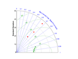
Calculate (and plot) skill statistics for model validation
# skillstats.m: Calculate (and plot) skill statistics for model validationAuthor: Kelly KearneyThis repository includes the code for the `skillstats.m` and `tayoloraxis.m` Matlab functions.The
- 16 (All time)
- 1 (Last 30 days)
- -- / 5
- Community
-
15 Aug 2024

Violin Plot based on kernel density estimation, using default ksdensity
This function creates simple violin plots by estimating the kernel density, using matlabs default ksdensity(). Given a matrix or table with m columns, you will get violins for each of the columns
- 25.5K (All time)
- 117 (Last 30 days)
- 4.9 / 5
- Community
-
3 Nov 2015
Circular Statistics Toolbox (Directional Statistics)
Compute descriptive and inferential statistics for circular or directional data.
CircStat for Matlab=======================Toolbox for circular statistics with Matlab. Authors: Philipp BerensEmail: philipp@bethgelab.orgHomepage
- 40.9K (All time)
- 111 (Last 30 days)
- 4.6 / 5
- Community
-
8 Jun 2012
Image Descriptive Statistic with ROI Selection
This is a simple script will let user select ROI on image and get its descriptive statistic features and column sum plot as well.
To use:1. Run the script2. Select image to work on. 3. Keep on drawing rectangle on the image of different region to keep getting their descriptive statistic features and column sum plots.
- 34 (All time)
- 1 (Last 30 days)
- -- / 5
- Community
-
3 Feb 2020

Create a fake box and whisker plot from pre-determined statistics (mean, standard deviation, and min/max).
Given pre-determined statistics (mean, standard deviation, and min/max), BOXPLOT_FROMSTATS uses errorbar.m and patch.m to create a fake box and whisker plot, similar to boxchart.m. Options include
- 53 (All time)
- 2 (Last 30 days)
- -- / 5
- Community
-
31 Oct 2022

Add statistical significance lines and asterisks to an existing plot
This script gets an axis handle and a 4D matrix (stats) and plots significance lines and asterisks on top.Significance lines and asterisks are added only for pairs assigned with a positive value (the
- 464 (All time)
- 1 (Last 30 days)
- 5.0 / 5
- Community
-
21 May 2021

- 3.4K (All time)
- 86 (Last 30 days)
- 4.8 / 5
- Community
-
26 May 2026

Bode plot with asymptotes
The function asymp() corresponds to bode(), but it also plots asymptotes for the magnitude and phase graphs. Phase asymptotes are only horizontal and vertical. asymp() only accepts SISO transfer
- 28.9K (All time)
- 130 (Last 30 days)
- 4.7 / 5
- Community
-
22 Sep 2020
plot spread points (beeswarm plot)
plotSpread plots distributions of data points, adding jitter to the points to avoid overlap.
plotSpread allows creating "beeswarm plots", i.e. point distributions where jitter has been added to the data points to avoid overlap.It further allows specifying groups within the data to show the
- 12.8K (All time)
- 6 (Last 30 days)
- 4.9 / 5
- Community
-
11 Feb 2017

Plot the phase portrait for the entered system of differential equations
using the app. The app works with limited functionality for versions preceding R2020b. For versions prior to R2020b, mouse click interactions with the plots (adding trajectories and guessing solutions) do
- 8.6K (All time)
- 48 (Last 30 days)
- 5.0 / 5
- Community
-
28 Mar 2021

Generate a bar plot with multiple stacks grouped together.
Plot a set of stacked bars, but group them according to labels provided.Params: stackData is a 3D matrix (i.e., stackData(i, j, k) => (Group, Stack, StackElement)) groupLabels is a CELL
- 12.5K (All time)
- 8 (Last 30 days)
- 4.8 / 5
- Community
-
13 Sep 2011
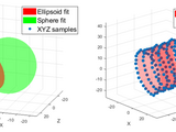
Object-oriented tools to fit/plot conics and quadrics
A tool set for fitting and/or plotting various conics and quadric surfaces, e.g., ellipses, cylinders, spheres, planes, cones, and lines.
This FEX submission offers a tool set for fitting and plotting 2D conics (ellipses, circles, lines,...) as well as 3D quadric surfaces (ellipsoids, spheres, planes, cylinders, cones,...). Each type
- 2.3K (All time)
- 9 (Last 30 days)
- 5.0 / 5
- Community
-
8 Feb 2024

- 7.1K (All time)
- 17 (Last 30 days)
- 4.7 / 5
- Community
-
31 Oct 2012
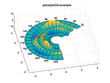
Plots 3d polar data with polar axis and polar grid
Polarplot3d produces surface, mesh, wireframe and contour plots for three dimensional polar data. A labeled polar axis is drawn at a fixed height or it can follow the surface contour at maximum
- 25.7K (All time)
- 12 (Last 30 days)
- 4.9 / 5
- Community
-
4 Mar 2016

This function plots a line vector with arrow head.
Arrowline 3-D vector plot.vectarrow(p0,p1) plots a line vector with arrow pointing from point p0 to point p1. The function can plot both 2D and 3D vector with arrow depending on the dimension of the
- 42.8K (All time)
- 158 (Last 30 days)
- 3.8 / 5
- Community
-
20 Apr 2005
Family of Rayleigh Statistics Toolbox
Implementations of Rayleigh, Moore-Rayleigh, and Scaled Rayleigh circular statistics
MATLAB toolbox implementing Rayleigh, Moore-Rayleigh, and Scaled Rayleigh circular statistics as well as visualisations for circular tests.
- 331 (All time)
- 3 (Last 30 days)
- 5.0 / 5
- Community
-
11 Apr 2016

Produces a plot who's y-axis skips to avoid unnecessary blank space
Produces a plot who's y-axis skips to avoid unecesary blank spaceReplaces BREAKAXIS
- 16.8K (All time)
- 19 (Last 30 days)
- 5.0 / 5
- Community
-
12 Nov 2008

This simple code enables you to plot using custom markers.
This simple code enables you to plot using custom markers. It uses custom patches instead of Matlab built-in markers.As the input, you need to provide x and y for the data points, like you do in
- 2.4K (All time)
- 4 (Last 30 days)
- 4.9 / 5
- Community
-
17 Dec 2012

Plots data density of a two-dimensional distribution for human viewing.
Data density can be hard to read from scatter plots due to overstriking. I therefore calculate data density at each pixel as the reciprocal of the sum of squared distance from each point, adding a
- 6.9K (All time)
- 2 (Last 30 days)
- 4.1 / 5
- Community
-
29 Nov 2014