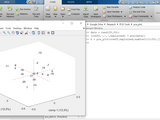
Make a better plot for your PCA results FAST! Have your data points labeled, so you can see them and compare more easily!
Try this:
data = rand(30,20);
[coeff,~,~,~,explained] = pca(data);
h = pca_plot(coeff,explained,num2cell(1:20),[],'.');
Cite As
Jiun Yen (2025). qks1lver/pca_plot (https://github.com/qks1lver/pca_plot), GitHub. Retrieved .
MATLAB Release Compatibility
Created with
R2016a
Compatible with any release
Platform Compatibility
Windows macOS LinuxCategories
- AI and Statistics > Statistics and Machine Learning Toolbox > Dimensionality Reduction and Feature Extraction >
Find more on Dimensionality Reduction and Feature Extraction in Help Center and MATLAB Answers
Tags
Community Treasure Hunt
Find the treasures in MATLAB Central and discover how the community can help you!
Start Hunting!Discover Live Editor
Create scripts with code, output, and formatted text in a single executable document.
Versions that use the GitHub default branch cannot be downloaded
| Version | Published | Release Notes | |
|---|---|---|---|
| 1.0.0.0 |
|
To view or report issues in this GitHub add-on, visit the GitHub Repository.
To view or report issues in this GitHub add-on, visit the GitHub Repository.


