plotLineHist
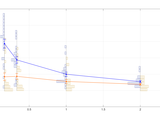
PlotLineHist take a cell array C, a matrix M, a function handle F, and several optional arguments. The cell array C is a nxm. You have to think of each row as being an experimental condition for one factor, and each column as the experimental condition for a second (optional) factor. The matrix M specifies the values for the row's factor ( λ in the figure). In the figure, each column's factor is represented by different colours.
PlotLineHist execute the function F (for example, @mean) for each cell of the cell array, plotting the resulting value and connecting the row's (continuous lines in the figure). It also calculates the standard error for each cell (vertical line on each marker).
However, the novelty is that it also plot a frequency distribution itself for each condition, and aligns it vertically on each row's factor. The distribution's value corresponds now to the vertical axis of the figure.
Each row distribution has a different colour. The first row's distribution is plotted on the left side, the others on the right (of course, having more than 3 row's condition will make the plot difficult to read, but it may still be useful in those cases).
Some examples available here: http://valeriobiscione.com/2015/11/09/plotlinehist-when-showing-stats-is-not-enough/
Cite As
Valerio Biscione (2026). plotLineHist (https://se.mathworks.com/matlabcentral/fileexchange/53875-plotlinehist), MATLAB Central File Exchange. Retrieved .
MATLAB Release Compatibility
Platform Compatibility
Windows macOS LinuxCategories
- MATLAB > Graphics > 2-D and 3-D Plots > Line Plots >
Tags
Community Treasure Hunt
Find the treasures in MATLAB Central and discover how the community can help you!
Start Hunting!Discover Live Editor
Create scripts with code, output, and formatted text in a single executable document.
plotLineHist/
plotLineHist/HelpFun/
| Version | Published | Release Notes | |
|---|---|---|---|
| 1.2 | fixed bug with barScale. |
|
|
| 1.0.0.0 |
|

