Use Area Plot to Compare Traffic Data Sets
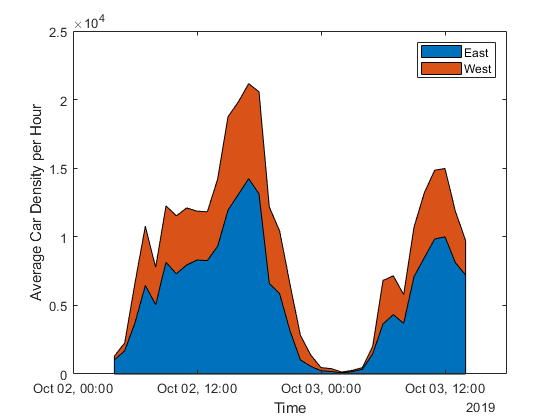
The MATLAB® Analysis and MATLAB Visualizations apps in ThingSpeak™ let you pick from a selection of code templates as a starting point for building your own project. This example demonstrates the use of an area plot to compare two similar variables with data read from an existing ThingSpeak channel.
ThingSpeak channel 38629 contains traffic data from Route 9 in Natick, Massachusetts. The data is generated from a video feed processed with a counting algorithm on a Raspberry Pi®. Field 1 contains the westbound car count, and field 2 contains the eastbound car counts.
Create a MATLAB Visualization from Template Code
To create an area plot of a set of data from a ThingSpeak channel, create a MATLAB script using the code template provided.
Navigate to the Apps tab, and select MATLAB Visualizations. Click New, choose Use area plot to compare traffic data sets, and click Create.

Visualize Your Data
ThingSpeak populates the MATLAB Code field with template code to read the data and then generate the area plot.
1) Set the variables for communicating with ThingSpeak. The car counter channel is public so you do not need to add the Read API Key. If you are reading from your own channel, you can modify these values.
readChannelID = 38629;
readAPIKey = '';
2) Use thingSpeakRead to read fields 1 and 2 of the last 33 hours of data. Using the timetable output format simplifies manipulating times and averaging data.
carData = thingSpeakRead(readChannelID,'Fields',[1 2],'NumMinutes',2000,...
    'ReadKey',readAPIKey,'Outputformat','Timetable');
3) Use retime (MATLAB) to average the data over each hour, and save it in a new timetable. Since the car counter records a value every 15 seconds, trends with a longer period are often hidden in the 15-second fluctuations. Multiply the 15-second average by 240 to express the average in terms of the number of cars in an hour.
aveCar = retime(carData,'hourly','mean');
eastCars = aveCar.DensityOfEastboundCars*240;
westCars = aveCar.DensityOfWestboundCars*240;
4) Use area (MATLAB) to plot the eastbound data and westbound data on the same axis. Use xlabel (MATLAB), ylabel (MATLAB), and legend (MATLAB) to set the appropriate labels on the plot. You can edit the template code to fit your application. For example, you can edit the number of days to read, and the plot titles in the code. Keep in mind that thingSpeakRead can only read 8000 data points in a single read, which is just over a single day of data.
area(aveCar.Timestamps,[eastCars,westCars]);
xlabel('Time');
ylabel('Average Car Density per Hour');
legend({'East','West'});

5) Press Save and Run to generate the plot. The area plot is generated from real-time data so your visualization is different than this plot.Note the prominent peaks for rush hours and during the lunch hour. The plot indicates that it is best to leave for work before 6 a.m., and head home after 8 p.m.
Add Visualization to Your Channel View
Optionally, you can add saved visualizations to your channel. In Display Settings, use the plus next to Add/Edit this Visualization to a Channel to expand the channels list.

Click the check box that corresponds to the channel you want to add the visualization to. To add private visualizations, check Private View. To share the URL and add the visualization to the Public View, click Create a public URL. To update your selections, click Save Display Settings.

See Also
Functions
Histogram(MATLAB) |thingSpeakRead|area(MATLAB) |retime(MATLAB) |xlabel(MATLAB) |ylabel(MATLAB) |legend(MATLAB)