Compare Multiple Distribution Fits
This example shows how to fit multiple probability distribution objects to the same set of sample data, and obtain a visual comparison of how well each distribution fits the data.
Step 1. Load sample data.
Load the sample data.
load carsmallThis data contains miles per gallon (MPG) measurements for different makes and models of cars, grouped by country of origin (Origin), model year (Model_Year), and other vehicle characteristics.
Step 2. Create a categorical array.
Transform Origin into a categorical array and remove the Italian car from the sample data. Since there is only one Italian car, fitdist cannot fit a distribution to that group using other than a kernel distribution.
Origin = categorical(cellstr(Origin));
MPG2 = MPG(Origin~="Italy");
Origin2 = Origin(Origin~="Italy");
Origin2 = removecats(Origin2,"Italy");
Step 3. Fit multiple distributions by group.
Use fitdist to fit Weibull, normal, logistic, and kernel distributions to each country of origin group in the MPG data.
[WeiByOrig,Country] = fitdist(MPG2,"weibull","by",Origin2);
[NormByOrig,Country] = fitdist(MPG2,"normal","by",Origin2);
[LogByOrig,Country] = fitdist(MPG2,"logistic","by",Origin2);
[KerByOrig,Country] = fitdist(MPG2,"kernel","by",Origin2);
WeiByOrig
WeiByOrig=1×5 cell array
    {1×1 prob.WeibullDistribution}    {1×1 prob.WeibullDistribution}    {1×1 prob.WeibullDistribution}    {1×1 prob.WeibullDistribution}    {1×1 prob.WeibullDistribution}
Country
Country = 5×1 cell
    {'France' }
    {'Germany'}
    {'Japan'  }
    {'Sweden' }
    {'USA'    }
Each country group now has four distribution objects associated with it. For example, the cell array WeiByOrig contains five Weibull distribution objects, one for each country represented in the sample data. Likewise, the cell array NormByOrig contains five normal distribution objects, and so on. Each object contains properties that hold information about the data, distribution, and parameters. The array Country lists the country of origin for each group in the same order as the distribution objects are stored in the cell arrays.
Step 4. Compute the pdf for each distribution.
Extract the four probability distribution objects for USA and compute the pdf for each distribution. As shown in Step 3, USA is in position 5 in each cell array.
WeiUSA = WeiByOrig{5};
NormUSA = NormByOrig{5};
LogUSA = LogByOrig{5};
KerUSA = KerByOrig{5};

x = 0:1:50;
pdf_Wei = pdf(WeiUSA,x);
pdf_Norm = pdf(NormUSA,x);
pdf_Log = pdf(LogUSA,x);
pdf_Ker = pdf(KerUSA,x);
Step 5. Plot pdf the for each distribution.
Plot the pdf for each distribution fit to the USA data, superimposed on a histogram of the sample data. Normalize the histogram for easier display.
Create a histogram of the USA sample data.
data = MPG(Origin2=="USA");
figure
histogram(data,10,Normalization="pdf",FaceAlpha=0.4);
Plot the pdf of each fitted distribution.
line(x,pdf_Wei,LineStyle="-",LineWidth=1)
line(x,pdf_Norm,LineStyle="-.",LineWidth=1)
line(x,pdf_Log,LineStyle="--",LineWidth=1)
line(x,pdf_Ker,LineStyle=":",LineWidth=1)
legend("Data","Weibull","Normal","Logistic","Kernel","Location","Best")
title("MPG for Cars from USA")
xlabel("MPG")

Superimposing the pdf plots over a histogram of the sample data provides a visual comparison of how well each type of distribution fits the data. Only the nonparametric kernel distribution KerUSA comes close to revealing the two modes in the original data.
Step 6. Further group USA data by year.
To investigate the two modes revealed in Step 5, group the MPG data by both country of origin (Origin) and model year (Model_Year), and use fitdist to fit kernel distributions to each group.
[KerByYearOrig,Names] = fitdist(MPG,"Kernel","By",{Origin Model_Year});
Each unique combination of origin and model year now has a kernel distribution object associated with it.
Names
Names = 14×1 cell
    {'France↵70' }
    {'France↵76' }
    {'Germany↵70'}
    {'Germany↵76'}
    {'Germany↵82'}
    {'Italy↵76'  }
    {'Japan↵70'  }
    {'Japan↵76'  }
    {'Japan↵82'  }
    {'Sweden↵70' }
    {'Sweden↵76' }
    {'USA↵70'    }
    {'USA↵76'    }
    {'USA↵82'    }
Plot the three probability distributions for each USA model year, which are in positions 12, 13, and 14 in the cell array KerByYearOrig.
figure
hold on
for i = 12 : 14
    plot(x,pdf(KerByYearOrig{i},x))
end
legend("1970","1976","1982")
title("MPG in USA Cars by Model Year")
xlabel("MPG")
hold off
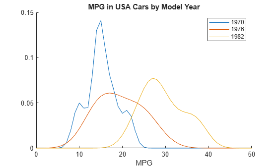
When further grouped by model year, the pdf plots reveal two distinct peaks in the MPG data for cars made in the USA — one for the model year 1970 and one for the model year 1982. This explains why the histogram for the combined USA miles per gallon data shows two peaks instead of one.