Image
Image UI component
Description
An image UI component displays a picture, such as an icon or logo, in an app. Use
the Image object to modify the appearance and behavior of an image after you
create it.
Creation
Create an image in an app using the uiimage
function.
Properties
Image
Image source or file, specified as a string scalar, a character vector, or an
m-by-n-by-3 truecolor image array. If you
specify a file name, it can be an image file name on the MATLAB® path or a full path to an image file. If you plan to share an app with
others, put the image file on the MATLAB path to facilitate app packaging.
Supported image formats include JPEG, PNG, GIF, SVG, or
m-by-n-by-3 truecolor image array. For more
information about truecolor image arrays, see Working with Image Types in MATLAB.
Example: im = uiimage(ImageSource="peppers.png");
Example: im.ImageSource = "C:\TEMP\ngc6543a.jpg";
Horizontal alignment of the rendered image within the image component area,
specified as 'center', 'left', or
'right'. The horizontal alignment is relative to the inside
borders of the image component. Setting this property has no effect when the
ScaleMethod property value is set to
'stretch'.
For example, the table shows rendered images for each
HorizontalAlignment value, where the
ScaleMethod property value is set to 'none'
and the VerticalAlignment property has the default value,
'center'. You can implement many other combinations that are not
shown here.
| Horizontal Alignment Value | Description | Rendered Image |
|---|---|---|
'center' | Left and right edges of the image are equally spaced from the inside-left and inside-right borders of the image component, respectively. |
|
'left' | Left edge of the image aligns with the inside-left border of the image component. |
|
'right' | Right edge of the image aligns with the inside-right border of the image component. |
|


Vertical alignment of the rendered image within the image component area,
specified as 'center', 'left', or
'right'. The vertical alignment is relative to the inside borders
of the image component. Setting this property has no effect when the
ScaleMethod property value is set to
'stretch'.
For example, the table shows rendered images for each
VerticalAlignment value, where the
ScaleMethod property value is set to 'none'
and the HorizontalAlignment property has the default value,
'center'. You can implement many other combinations that are not
shown here.
| Vertical Alignment Value | Description | Rendered Image |
|---|---|---|
'center' | Top and bottom edges of the image are equally spaced from the inside-top and inside-bottom borders of the image component, respectively. |
|
'top' | Top edge of the image aligns with the inside-top border of the image component. |
|
'bottom' | Bottom edge of the image aligns with the inside-bottom border of the image component. |
|


Image scaling method, specified as one of the values listed in the table. Use this name-value pair argument to specify how you want your image to render within the component area.
The table also demonstrates each scale method with an example image. In the rendered image
examples, the BackgroundColor property of the image component has been
set to 'magenta'. The scaling behavior of SVG image files may vary based on
how the file is defined.
| Value | Description | Example | Scales Up | Scales Down | Maintains Aspect Ratio | Clips Image | |
|---|---|---|---|---|---|---|---|
| Original Image | Rendered Image | ||||||
'fit' | Scales in any direction to display the image within the component area, and maintains aspect ratio without clipping. |
|
| Yes | Yes | Yes | No |
'fill' | Scales in any direction to fill the component area, maintaining aspect ratio and clipping if necessary. |
|
| Yes | Yes | Yes | Yes |
'none' | Uses the actual size of the image and maintains aspect ratio. If the component area is smaller than the image, the image is clipped. |
|
| No | No | Yes | Yes |
'scaledown' | Scales down and maintains aspect ratio without clipping. If the original image is larger than the
component area, the image scales down and renders as if the |
|
| No | Yes | Yes | No |
'scaleup' | Scales up and maintains aspect ratio with clipping. If the original image is smaller than the
component area, the image scales up and renders as if the |
|
| Yes | No | Yes | Yes |
'stretch' | Scales in any direction to fill the component area, without maintaining the aspect ratio and without clipping. |
|
| Yes | Yes | No | No |


Color
Background color, specified as an RGB triplet, a hexadecimal color code, or one of the color options listed in the table.
For a custom color, specify an RGB triplet or a hexadecimal color code.
An RGB triplet is a three-element row vector whose elements specify the intensities of the red, green, and blue components of the color. The intensities must be in the range
[0,1], for example,[0.4 0.6 0.7].A hexadecimal color code is a string scalar or character vector that starts with a hash symbol (
#) followed by three or six hexadecimal digits, which can range from0toF. The values are not case sensitive. Therefore, the color codes"#FF8800","#ff8800","#F80", and"#f80"are equivalent.
Alternatively, you can specify some common colors by name. This table lists the named color options, the equivalent RGB triplets, and the hexadecimal color codes.
| Color Name | Short Name | RGB Triplet | Hexadecimal Color Code | Appearance |
|---|---|---|---|---|
"red" | "r" | [1 0 0] | "#FF0000" |
|
"green" | "g" | [0 1 0] | "#00FF00" |
|
"blue" | "b" | [0 0 1] | "#0000FF" |
|
"cyan"
| "c" | [0 1 1] | "#00FFFF" |
|
"magenta" | "m" | [1 0 1] | "#FF00FF" |
|
"yellow" | "y" | [1 1 0] | "#FFFF00" |
|
"black" | "k" | [0 0 0] | "#000000" |
|
"white" | "w" | [1 1 1] | "#FFFFFF" |
|
"none" | Not applicable | Not applicable | Not applicable | No color |
This table lists the default color palettes for plots in the light and dark themes.
| Palette | Palette Colors |
|---|---|
Before R2025a: Most plots use these colors by default. |
|
|
|
You can get the RGB triplets and hexadecimal color codes for these palettes using the orderedcolors and rgb2hex functions. For example, get the RGB triplets for the "gem" palette and convert them to hexadecimal color codes.
RGB = orderedcolors("gem");
H = rgb2hex(RGB);
Before R2023b: Get the RGB triplets using RGB =
get(groot,"FactoryAxesColorOrder").
Before R2024a: Get the hexadecimal color codes using H =
compose("#%02X%02X%02X",round(RGB*255)).
Interactivity
Image hyperlink URL, specified as a character vector or string scalar. When a user clicks the image, the web address specified by the URL opens in a new browser tab. If the user is running the app in a browser using MATLAB Online™ or as a web app, the new tab opens in the current browser. Otherwise, the new tab opens in the default browser on the user's system.
Image alt text (or alternative text), specified as a string scalar or character vector. Use this property to provide a description of the image. Screen readers use this text to describe the image.
Tooltip, specified as a character vector, cell array of character vectors, string array, or 1-D categorical array. Use this property to display a message when the user hovers the pointer over the component at run time. The tooltip displays even when the component is disabled. To display multiple lines of text, specify a cell array of character vectors or a string array. Each element in the array becomes a separate line of text. If you specify this property as a categorical array, MATLAB uses the values in the array, not the full set of categories.
Context menu, specified as a ContextMenu object created using the uicontextmenu function. Use this property to display a context menu when
you right-click on a component.
Position
Location and size of image component relative to the parent, specified as a four element vector of the form [left bottom width height]. This table describes each element in the vector.
| Element | Description |
|---|---|
left | Distance from the inner left edge of the parent container to the outer left edge of the image component |
bottom | Distance from the inner bottom edge of the parent container to the outer bottom edge of the image component |
width | Distance between the right and left outer edges of the image component |
height | Distance between the top and bottom outer edges of the image component |
The Position values are relative to the drawable area of the parent container. The drawable area is the area inside the borders of the container and does not include the area occupied by decorations such as a menu bar or title.
All measurements are in pixel units.
Inner location and size of image component, specified as a four element vector of
the form [left bottom width height]. All measurements are in pixel
units. This property value is identical to the Position
property.
This property is read-only.
Outer location and size of image component, returned as a four element vector of
the form [left bottom width height]. All measurements are in pixel
units. This property value is identical to the Position
property.
Layout options, specified as a
GridLayoutOptions object. This property specifies options for components
that are children of grid layout containers. If the component is not a child of a grid layout
container (for example, it is a child of a figure or panel), then this property is empty and has
no effect. However, if the component is a child of a grid layout container, you can place the
component in the intended row and column of the grid by setting the Row and
Column properties of the GridLayoutOptions
object.
For example, this code places an image component in the third row and second column of its parent grid.
g = uigridlayout([4 3]);
im = uiimage(g);
im.ImageSource = 'peppers.png';
im.ScaleMethod = 'fill';
im.Layout.Row = 3;
im.Layout.Column = 2;
To make the image span multiple rows or columns, specify the
Row or Column property as a two-element
vector. For example, this image spans columns 2 through
3.
im.Layout.Column = [2 3];
Callbacks
Image clicked callback, specified as one of these values:
A function handle.
A cell array in which the first element is a function handle. Subsequent elements in the cell array are the arguments to pass to the callback function.
A character vector containing a valid MATLAB expression (not recommended). MATLAB evaluates this expression in the base workspace.
This callback executes when the user clicks the image in the app. If you specify a
link to open using the URL property, the callback executes after
that link opens.
This callback function can access specific information about the user's
interaction with the image. MATLAB passes this information in an ImageClickedData object
as the second argument to your callback function. In App Designer, the argument is
called event. You can query the object's properties using dot
notation. For example, event.Source returns the
Image object that the user is interacting with to trigger the
callback. The ImageClickedData object is not available to callback
functions specified as character vectors.
The following table lists the properties of the
ImageClickedData object.
| Property | Value |
|---|---|
EventName | 'ImageClicked' |
Source | Component executing the callback |
For more information about writing callbacks, see Callbacks in App Designer.
Callback Execution Control
Parent/Child
Parent container, specified as a Figure object or
one of its child containers: Tab, Panel, ButtonGroup, or
GridLayout. If no container is specified,
MATLAB calls the uifigure function to create a new Figure object that serves as the parent container.
Identifiers
This property is read-only.
Type of graphics object, returned as 'uiimage'.
Object Functions
focus | Give focus to UI component |
Examples
Create an image component within a figure. The default image displays.
fig = uifigure;
im = uiimage(fig);

Now, add a picture to the image component.
im.ImageSource = "peppers.png";
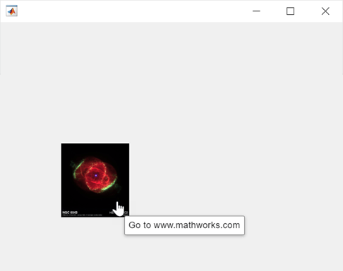
Create an image and specify a URL that opens in a new browser tab when you click the image. Specify a tooltip that appears when you point to the image.
fig = uifigure;
im = uiimage(fig);
im.ImageSource = "ngc6543a.jpg";
im.URL = "https://www.mathworks.com/";
im.Tooltip = "Go to www.mathworks.com";
Before R2022b: Use the ImageClickedFcn
property instead of the URL property and create a callback using a
function
handle.
im.ImageClickedFcn = @(src,event)web("https://www.mathworks.com/");Create an image component that displays an animated GIF using the actual size of the image.
fig = uifigure;
im = uiimage(fig,"ImageSource","questions.gif");
im.ScaleMethod = "none";

Now, scale the image so that it fits within the default component area, preserving aspect ratio and without clipping. Then, apply a black background to create the appearance of letterboxing (black bars above and below the image).
im.ScaleMethod = "scaledown";
im.BackgroundColor = "black";

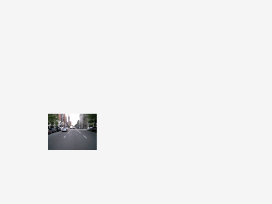
Create an image component that displays a picture of a street. Provide a description of the image by specifying alt text (or alternative text) using the AltText property. Screen readers use this text to describe the image.
fig = uifigure;
im = uiimage(fig,ImageSource="street1.jpg", ...
    AltText="City street including cars, signs, and buildings");