Create Plot
Interactively create and explore visualizations in the Live Editor
Description
The Create Plot task lets you interactively create and explore visualizations for your data. Choose visualizations from a list of categories or let the task recommend them based on your workspace variables. The task automatically generates MATLAB® code and adds labels to the generated visualization.
Using this task, you can:
Create a plot by selecting variables and a chart type.
Explore different visualizations of the same data. Select some variables first, then try selecting different chart types.
Explore different data in the same visualization format. Select the chart type first. The task will prompt you for data.
Combine multiple plots. Overlay or combine multiple visualizations by clicking on the Add tab.
Customize the appearance of your plot. For example, you can change the marker symbol for line charts and the arrangement of bars for bar charts.
The Create Plot task supports most MATLAB plots, including line plots, scatter plots, and histograms. For a list of plots and functions to generate them programmatically, see Types of MATLAB Plots.
This task also supports some charts from Signal Processing Toolbox™ and Control System Toolbox™. For more information about visualizing signal spectra, filter responses, and time-frequency features of signals, see Create Plot (Signal Processing Toolbox). For more information about creating linear analysis plots with dynamic system models, see Create Plot (Control System Toolbox).

Open the Task
To add the Create Plot task to a live script in the MATLAB Editor:
On the Live Editor tab, select Task > Create Plot.
In a code block in the script, type a relevant keyword, such as
viz,visualize,create, orhold. Select Create Plot from the suggested command completions.In a code block in the script, type the name of a charting function, such as
plot,bar, orcontour. Select Create Plot from the suggested command completions. When you add the task using this method, then MATLAB automatically selects the corresponding chart type in the Select visualization section of the task.
Examples
Create a visualization for a data set and customize visualization parameters with Create Plot.
Read the sample data patients.mat. The file contains 10 columns of data representing fictional medical patient information.
load patientsVisualize the relationship between the Age and Diastolic variables with a scatter plot. First, create a scatter plot by adding the Create Plot task to your live script and specifying the desired visualization as a scatter plot.
Then, select the data for the plot by setting the X menu item to the Age variable and setting the Y menu item to the Diastolic variable.
Next, view the optional visualization parameters by opening the Select optional visualization parameters task section. Then, customize the scatter plot markers by setting the Marker symbol menu item to the + symbol.
The resulting visualization contains a scatter plot of Diastolic vs. Age with a + marker for each data point.


Overlay multiple plots into a single visualization with Create Plot.
Read the sample data patients.mat. The file contains 10 columns of data representing fictional medical patient information.
load patientsVisualize the relationship between the Age and Diastolic variables with a scatter plot. First, create a scatter plot by adding the Create Plot task to your live script and specifying the desired visualization as a scatter plot.
Then, select the data for the plot by setting the X menu item to the Age variable and setting the Y menu item to the Diastolic variable.
The resulting visualization contains a scatter plot of Diastolic vs. Age.


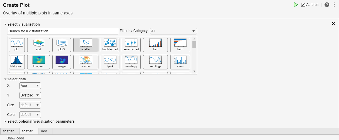
Next, visualize the relationship between the Age and Systolic variables with a scatter plot. First, overlay another plot by clicking the Add tab below the existing task parameter section.
Then, select the data for the plot by setting the Y menu item to the Systolic variable.
The resulting visualization contains multiple scatter plots in the same axes, Systolic vs. Age and Diastolic vs. Age.

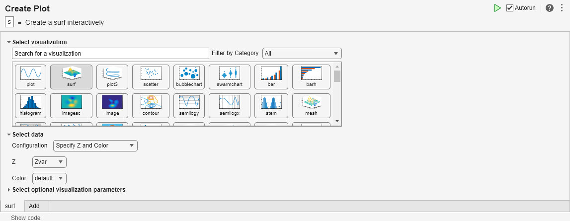
Some plotting functions, like surf, accept more than one input configuration. Customize the configuration of a visualization to fit the data with Create Plot.
Generate the data to be plotted using the peaks function.
Zvar = peaks;
Visualize the generated data with a surface plot. First, create a surface plot by adding the Create Plot task to your live script and specifying the desired visualization as a surface plot.
Then, select the appropriate configuration for the generated data. Because the data is contained within one array Zvar, set the Configuration menu item to Specify Z and Color. As a result, surf only requires one data input, Z.
Next, visualize the data by setting the Z data input menu item to the Zvar variable.
The resulting visualization shows the surface created by the Z data, where the Zvar variable defines by default both the height of the surface and the surface colors.

Related Examples
Tips
To interactively customize the text of titles, labels, and legends, select the plot in the output of the Live Editor and use the options in the Figure tab.
Version History
Introduced in R2021aSee Also
Functions
Live Editor Tasks
- Create Plot (Signal Processing Toolbox) | Create Plot (Control System Toolbox)