Overlay Bar Graphs
This example shows how to overlay two bar graphs and specify the bar colors and widths. Then, it shows how to add a legend, display the grid lines, and specify the tick labels.
Create a bar graph. Set the bar width to 0.5 so that the bars use 50% of the available space. Specify the bar color by setting the FaceColor property to an RGB color value.
x = [1 2 3 4 5];
temp_high = [37 39 46 56 67];
w1 = 0.5;
bar(x,temp_high,w1,'FaceColor',[0.2 0.2 0.5])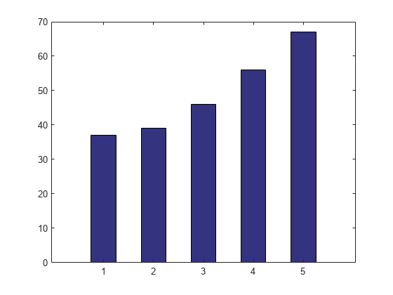
Plot a second bar graph over the first bar graph. Use the hold function to retain the first graph. Set the bar width to .25 so that the bars use 25% of the available space. Specify a different RGB color value for the bar color.
temp_low = [22 24 32 41 50];
w2 = .25;
hold on
bar(x,temp_low,w2,'FaceColor',[0 0.7 0.7])
hold off

Add grid lines, a y-axis label, and a legend in the upper left corner. Specify the legend descriptions in the order that you create the graphs.
grid on
ylabel('Temperature (\circF)')
legend({'Average High','Average Low'},'Location','northwest')

Specify the x-axis tick labels by setting the XTick and XTickLabel properties of the axes object. The XTick property specifies tick value locations along the x-axis. The XTickLabel property specifies the text to use at each tick value. Rotate the labels using the XTickLabelRotation property. Use dot notation to set properties.
ax = gca;
ax.XTick = [1 2 3 4 5];
ax.XTickLabels = {'January','February','March','April','May'};
ax.XTickLabelRotation = 45;