Display Data with Multiple Scales and Axes Limits
You can use a variety of techniques to visualize data with multiple scales and axis
limits. For example, you can use the yyaxis function to create plots with two y-axes. To
create plots with multiple x- and y-axes, multiple
colorbars, or to create a plot with a discontinuous axis that is broken into intervals,
use the tiledlayout function.
Display Data with Two y-Axes
Use the yyaxis function to create a plot with two y-axes. For example, you can use two y-axes to plot two lines on different scales.
Create an axes object, and activate the left y-axis by calling yyaxis left. Then plot a sine wave.
figure
yyaxis left
x = linspace(0,10);
y = sin(3*x);
plot(x,y)
Activate the right y-axis by calling yyaxis right. Then plot an amplified sine wave.
yyaxis right
y2 = sin(3*x).*exp(0.5*x);
plot(x,y2)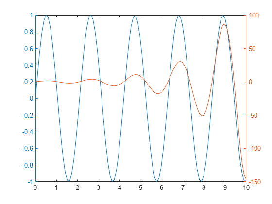
Display Data with Multiple x-Axes and y-Axes
Since R2019b
To plot two sets of data with separate x- and y-axes, create two separate axes objects in a tiled chart layout. Within one of the axes objects, move the x-axis to the top of the plot box, and move the y-axis to the right side of the plot box.
For example, you can create two plots that have different x- and y-axis limits.
First, create two sets of x- and y-coordinates.
x1 = 0:0.1:40;
y1 = 4.*cos(x1)./(x1+2);
x2 = 1:0.2:20;
y2 = x2.^2./x2.^3;
Create a tiled chart layout and an axes object. Then plot into the axes:
Create a
1-by-1tiled chart layoutt.Create an axes object
ax1by calling theaxesfunction and specifyingtas the parent object.Plot
x1andy1as a red line, and specifyax1as the target axes.Change the color of the x-axis and y-axis to match the plotted line. Setting properties on the axes after plotting ensures that the settings persist.
t = tiledlayout(1,1);
ax1 = axes(t);
plot(ax1,x1,y1,'-r')
ax1.XColor = 'r';
ax1.YColor = 'r';

Create a second axes object and plot the second set of data in black rather than red. Then, set properties on the second axes object to move the x-axis and y-axis, and to ensure that neither plot obscures the other.
Create an axes object
ax2by calling theaxesfunction and specifyingtas the parent object.Plot
x2andy2as a black line, and specifyax2as the target axes.Move the x-axis to the top, and move the y-axis to the right.
Set the color of the axes object to
'none'so that the underlying plot is visible.Turn off the plot boxes to prevent the box edges from obscuring the x- and y-axes.
ax2 = axes(t);
plot(ax2,x2,y2,'-k')
ax2.XAxisLocation = 'top';
ax2.YAxisLocation = 'right';
ax2.Color = 'none';
ax1.Box = 'off';
ax2.Box = 'off';

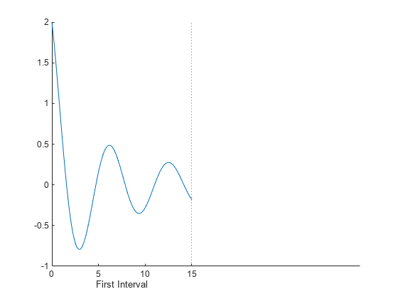
Plot Data on Discontinuous x-Axis
Since R2019b
You can use a tiled chart layout to give the appearance of a plot that is broken into intervals along one axis. For example, you might want to exclude one section of the x-axis to focus on other regions of interest.
Create coordinate vectors x and y.
x = 0:0.1:60;
y = 4.*cos(x)./(x+2);
Create a tiled chart layout containing two tiles, and place an axes object across both tiles. In the final presentation, this axes object will appear in the background, behind two other axes objects. A section of its x-axis will be visible to give the appearance of one long x-axis.
Create a
1-by-2tiled chart layoutt, and specify compact tile spacing. Setting the tile spacing allows you to control the size of the gap between the x-axis intervals.Create the background axes
bgAxby calling theaxesfunction and specifyingtas the parent object. Specify name-value arguments to remove all the ticks and turn off the plot box.Span the background axes across both tiles by setting the
Layout.TileSpanproperty ofbgAxto[1 2].
figure
t = tiledlayout(1,2,'TileSpacing','compact');
bgAx = axes(t,'XTick',[],'YTick',[],'Box','off');
bgAx.Layout.TileSpan = [1 2];

Create an axes object in front of bgAx in the first tile. Plot x and y, and set the x-axis limits to the first interval:
Create
ax1by calling theaxesfunction and specifyingtas the parent object. By default, the axes goes into the first tile.Plot x and y into
ax1.Call the
xlinefunction to display a dotted vertical line at the upper limit of the first interval.Set the x-axis limits to the first interval,
[0 15].Add an axis label to identify the first interval.
ax1 = axes(t);
plot(ax1,x,y)
xline(ax1,15,':');
ax1.Box = 'off';
xlim(ax1,[0 15])
xlabel(ax1, 'First Interval')
Repeat the process to create another axes object and plot for the second interval. The axes appears in the first tile by default. Move it to the second tile by setting the Layout.Tile property of the axes to 2. Then, link the axes so that the limits of both y-axes match.
% Create second plot
ax2 = axes(t);
ax2.Layout.Tile = 2;
plot(ax2,x,y)
xline(ax2,45,':');
ax2.YAxis.Visible = 'off';
ax2.Box = 'off';
xlim(ax2,[45 60])
xlabel(ax2,'Second Interval')

% Link the axes
linkaxes([ax1 ax2], 'y')

To add a title, pass the tiled chart layout to the title function.
title(t,'Attenuated Cosine Function')
Display Two Sets of Data with Separate Colorbars
Since R2020b
An axes object can accommodate only one colorbar. To create a visualization with multiple colorbars, stack multiple axes objects in a tiled chart layout. Make only one of the axes visible, but display a colorbar next to each of them in an outer tile of the layout.
Create the coordinate vectors, size data, and color data for two bubble charts.
x = 1:15;
n = 70 * randn(1,15) + 50;
y1 = n + x.^2;
y2 = n - linspace(1,225,15);
sz1 = rand(1,15);
sz2 = rand(1,15);
c = linspace(1,10,15);
Stack two axes objects, each containing a bubble chart, in a tiled chart layout.
Create a
1-by-1tiled chart layoutt.Create axes object
ax1and a bubble chart with thewintercolormap.Create axes object
ax2and a bubble chart with theautumncolormap. Make this axes object invisible by setting theVisibleproperty to'off'.Link the axes objects to keep them in sync. In this case, you can pass the children of
tto thelinkaxesfunction. Alternatively, you can pass a vector of individual axes objects to the function.
% create first bubble chart with winter colormap
t = tiledlayout(1,1);
ax1 = axes(t);
bubblechart(ax1,x,y1,sz1,c)
colormap(ax1,'winter')

% create second bubble chart with autumn colormap
ax2 = axes(t);
bubblechart(ax2,x,y2,sz2,c)
colormap(ax2,'autumn')
ax2.Visible = 'off';

% link the limits of axes
linkaxes(t.Children)

Display a colorbar with a label for each axes object in the east tile of the layout. The layout arranges the colorbars and keeps them aligned.
cb1 = colorbar(ax1);
cb1.Layout.Tile = 'east';
cb1.Label.String = 'Time (s)';

cb2 = colorbar(ax2);
cb2.Layout.Tile = 'east';
cb2.Label.String = 'Concentration (M)';

See Also
Functions
tiledlayout|yyaxis|axes