Configure Property Display for Custom UI Components in App Designer
When you develop a custom UI component in App Designer, you can provide customization options for app creators that use your component by creating public properties. This example shows how to design these public properties so app creators can easily modify them from within App Designer. Specify the data types and other requirements for the public properties so app creators can enter only valid values. For more information about creating public properties, see Create Public Properties for Custom UI Components in App Designer.
This table shows how each of the property types appears in the Component Browser when the component is used in an app.
| Property Type | Component Browser Input |
|---|---|
| Numeric | Edit field |
| Text | Edit field |
| Logical | Check box |
| Enumeration | Drop-down list |
Create Custom UI Component for App Text Styling
For this example, create a custom component to quickly and consistently style app text,
such as changing the font size and color of the text in the app. Create a component named
StylableText that consists of an underlying label component and four
public properties to demonstrate the allowable property types for a custom UI component:
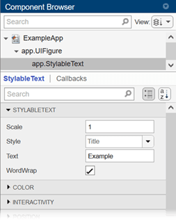
Scale: Font size scale, specified as a numeric property of typedouble. App creators can change the property in an App Designer app by entering a value greater than0in an edit field.Text: Component text, specified as a text property of typestring. App creators can change the property in an App Designer app by entering text in an edit field.WordWrap: Text wrap, specified as a logical property of typematlab.lang.OnOffSwitchState. App creators can change the property in an App Designer app by toggling a check box.Style: Font size and color, specified as an enumeration property of typeTextStyle(custom enumeration class). App creators can change the property in an App Designer app by selecting an option from a drop-down list.
To create the custom component, open a new blank component in App Designer. In
Design View, add a Label from the
Component Library. Save this new component as
StylableText.mlapp.
Create Numeric Property
Create a public property with a numeric data type when a component has a numeric value that app creators can change.
In the StylableText component, create a public numeric property that
scales the font size of each style given by the Style property. Specify
these fields in the Add Property dialog box:
Name:
ScaleData Type:
doubleDefault Value:
1Validation Functions:
mustBeGreaterThan(0)
Add this code to the update function in Code
View to set the FontSize property of the underlying label
component. Define FontSize as a product of the font size given by the
Style property and
Scale.
comp.Label.FontSize = comp.Style.FontSize*comp.Scale;
When app creators use the component in an app, they can change the text scaling by
entering a scale factor greater than 0 in the Scale
edit field in the Component Browser.
Create Text Property
Create a public property with a textual data type when a component has text that app creators can change.
In the StylableText component, create a public text property that
controls the text of the label component. Specify these fields in the Add
Property dialog box:
Name:
TextData Type:
stringDefault Value:
"Example"
Add this code to the update function in Code
View to link the public property to the Text property of the
underlying label
component.
comp.Label.Text = comp.Text;
When app creators use the component in an app, they can change the label text by
entering text in the Text edit field in the Component
Browser.
Create On/Off Logical Property
Create a public property with a logical data type when a component has two distinct
states that app creators can change. Use the matlab.lang.OnOffSwitchState data type. Existing UI components in MATLAB® use this data type for logical properties. Type this class into the
Data Type field instead of selecting an option from the drop-down
list.
In the StylableText component, create a public logical property that
determines whether the text wraps. Specify these fields in the Add
Property dialog box:
Name:
WordWrapData Type:
matlab.lang.OnOffSwitchStateDefault Value:
matlab.lang.OnOffSwitchState.on
Add this code to the update function in Code
View to link the public property to the WordWrap property of
the underlying label
component.
comp.Label.WordWrap = comp.WordWrap;
When app creators use the component in an app, they can control whether the text wraps
with the WordWrap check box in the Component
Browser.
Create Custom Enumerated Property
Create a public property with a custom enumeration class when a component has discrete
predetermined configurations that app creators can select. First, define an enumeration
class in MATLAB that stores the valid public property values and configurations. To define an
enumeration class, add an enumeration block to a class definition. Then,
add a public property with that enumeration class as the data type to the component in App
Designer. For more information on enumeration classes, see Define Enumeration Classes.
For this example, create a class that enumerates a set of formatting styles, such as title and heading styles. Each style has associated values that specify the font size and color. In the MATLAB Editor:
Create a new class named
TextStyle.Define two properties to store the font size and color.
Define an enumerated set of text styles with associated properties.
classdef TextStyle
    properties
        FontSize
        FontColor
    end

    enumeration
        Body (12, [0 0 0])
        Heading1 (18, [0 0.4470 0.7410])
        Heading2 (16, [0.3010 0.7450 0.9330])
        Title (24, [0.6350 0.0780 0.1840])
    end

    methods
        function obj = TextStyle(size,color)
            obj.FontSize = size;
            obj.FontColor = color;
        end
    end
end
TextStyle.m in the same folder as the
StylableText component. In the StylableText component in App Designer, create a public
property. Specify these fields in the Add Property dialog box:
Name:
StyleData Type:
TextStyleDefault Value:
TextStyle.Title
Add this code to the update function in Code
View to link the public property to the FontSize and
FontColor properties of the underlying label
component.
comp.Label.FontSize = comp.Style.FontSize*comp.Scale;
comp.Label.FontColor = comp.Style.FontColor;
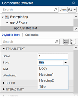
Style drop-down list in the
Component Browser. For example, setting the Style
property to Title sets the label font size to 24 and the label font color
to the RGB triplet [0.6350 0.0780 0.1840].Use Custom UI Component in App
To see how the public properties of the StylableText component appear in the Component Browser, configure the component for use in an app. For more information, see Configure Custom UI Components for App Designer.
In a new blank app in App Designer, add a StylableText component. Edit the public properties in the Component Browser using the different input fields.
Use the drop-down list to select a different option for the Style property. The options are defined by the enumeration in the TextStyle class.
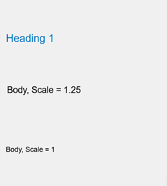
Use multiple StylableText components with different property values in the same app. For example, this app has three components. One uses the Style option Heading1. The other two use the Style option Body. One of these components sets Scale to 1. The other sets Scale to 1.25. The value of the Text property of each component describes the corresponding text style.