Explore Exposure at Default and Associated Components Using the SA-CCR Analyzer App
This example shows how to use the SA-CCR Analyzer app to compute, visualize, and export calculations of the exposure at default (EAD), replacement cost (RC), add-ons, and potential future exposure (PFE) from data for portfolios in an ISDA® SA-CCR CRIF file.
Import Data
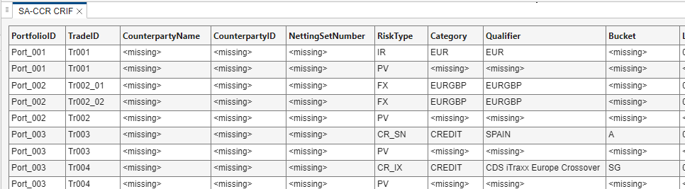
Open the SA-CCR Analyzer app and import the SACCR_CRIF_Ports_1_to_9.csv file, which is attached to this example. The SA-CCR CRIF file displays in the SA-CCR CRIF tab in the Results pane of the main app window.
Generate Baseline Plots and Results
To start the analysis, click the Analyze Portfolios ![]() button from the Analysis section of the app toolbar. The app then displays the Portfolios from the SA-CCR CRIF file in the Portfolio Browser pane and generates the plots and results for EAD, RC, add-ons, and PFE.
button from the Analysis section of the app toolbar. The app then displays the Portfolios from the SA-CCR CRIF file in the Portfolio Browser pane and generates the plots and results for EAD, RC, add-ons, and PFE.
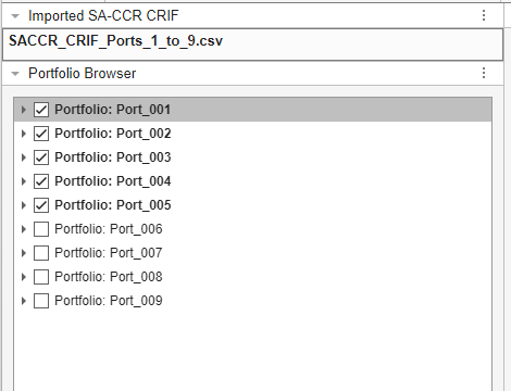
Plots and tabulated results are shown in the Plots pane and Results pane, respectively. By default, the app limits output to the first five portfolios in the imported data. You can select, expand, and collapse portfolios and trades in the Portfolio Browser pane. When you select a portfolio or trade, the app displays the details in the Details pane. Select all the portfolios for analysis by checking the boxes next to the deselected portfolios. Alternatively, right-click the Portfolio Browser pane and click Check All. Select Analyze Portfolios ![]() again to regenerate analysis according to the new portfolio selection. Or, select Auto from the Analyzer toolbar before changing the portfolio selection to update the plots and results automatically.
again to regenerate analysis according to the new portfolio selection. Or, select Auto from the Analyzer toolbar before changing the portfolio selection to update the plots and results automatically.
Analyze EAD
After performing the analysis, explore the results generated for EAD. The Plots pane contains several plots that illustrate the calculations for EAD and its associated components.
EAD is defined by this equation:
The EAD Breakdown Plot is a visualization of total EAD with labeled components for RC, PFE, and the Alpha Scaling Effect.
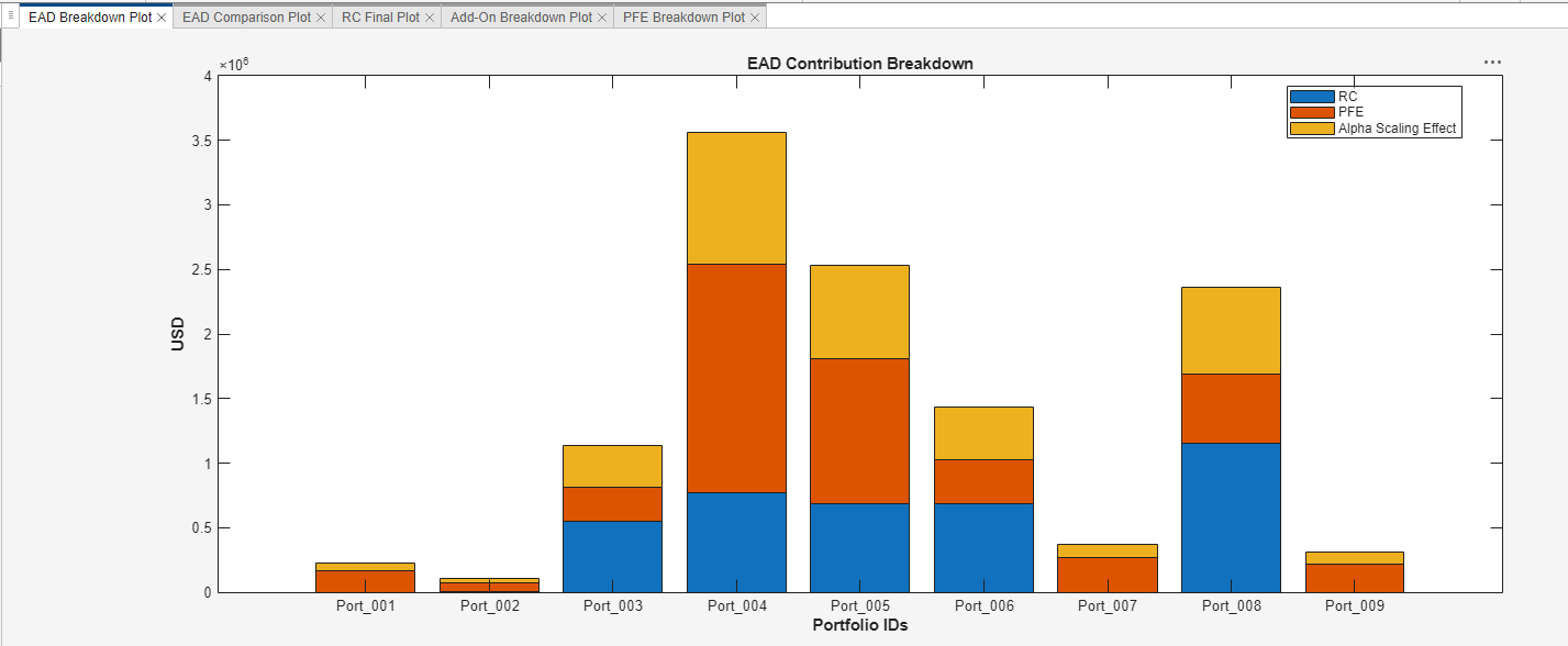
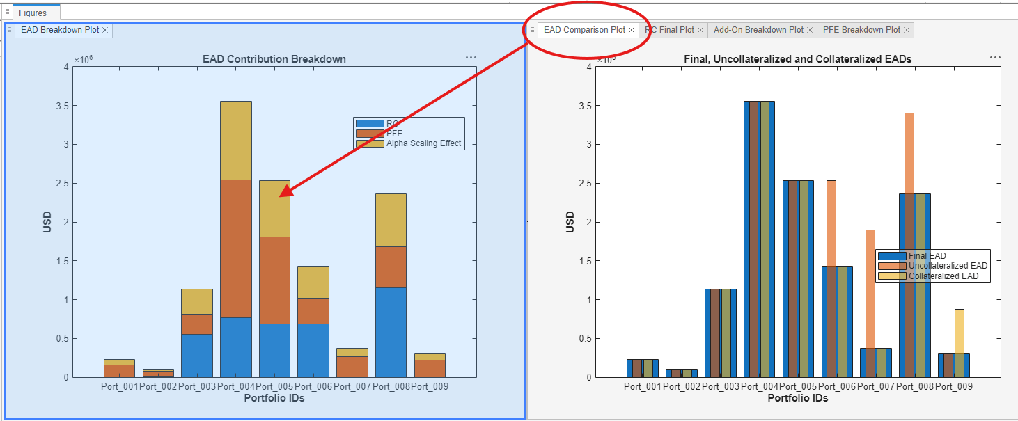
From this plot, observe that Port_004 has the greatest EAD, meaning this portfolio contains the greatest potential loss that a bank or financial institution could face if a counterparty were to default. By contrast, Port_002 contains the least potential loss. For more information about EAD, see Exposure at Default and eadChart.
This plot also indicates the contributions of RC and PFE on the total EAD for the portfolios. For example, the exposure of Port_003 is mostly made up of replacement cost, which represents the loss if a counterparty defaults and its transactions are immediately closed out, while Port_004's largest exposure component is potential future exposure. For more information on these metrics, see rc, pfe, and addOn.
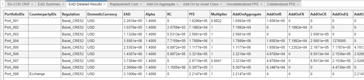
The calculations for EAD, RC, and PFE depicted in this plot are also tabulated in the EAD Summary table in the Results pane, with additional metrics such as add-on contributions provided in the EAD Detailed Results table.
Generate Additional Plots
Running the analysis prepopulates a set of plots to help interpret the data. Different plots can offer new information and insights. Navigate to the Plots section of the toolbar to see the available EAD plots for the portfolios. To add plots to the analysis, select the drop-down menu in the Plots section of the toolbar.
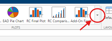
Select the EAD Pie Chart to add a new view of the EAD composition of the portfolios to the Plots pane.
Rearrange Plots and Results
To adjust the presentation of the plots and tables, select the three vertical dots ![]() on the top-right of either the Plots or Results pane.
on the top-right of either the Plots or Results pane.
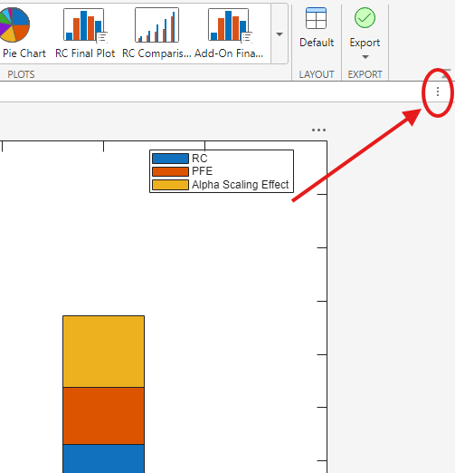
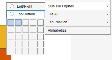
Next, access the Sub-Tile Figures drop-down menu to adjust the presentation of the elements of the pane. You can create sub-panes to display more elements at once and group the elements from the parent pane. Click the three vertical dots ![]() on the top-right of the Plots pane, and then choose Sub-Tile Figures as shown in this image.
on the top-right of the Plots pane, and then choose Sub-Tile Figures as shown in this image.
This option creates two sub-panes in the Plots pane. Group the EAD plots in one pane by clicking and dragging the tabs in the right pane with EAD plots into the center of the left pane.
You can also use the Tile All drop-down menu to adjust the number of parent panes visible in the main window.
You can always return to the default display by selecting Default in the Layout section of the app toolbar.
Analyze RC
By default, the analysis generates the RC Final Plot, which portrays the RC for each portfolio selected between the uncollateralized and collateralized values to minimize EAD. The uncollateralized and collateralized values are given in the Replacement Cost table in the Results pane.
Visualize the uncollateralized and collateralized RC metrics by adding the RC Comparison plot to the Plots pane.
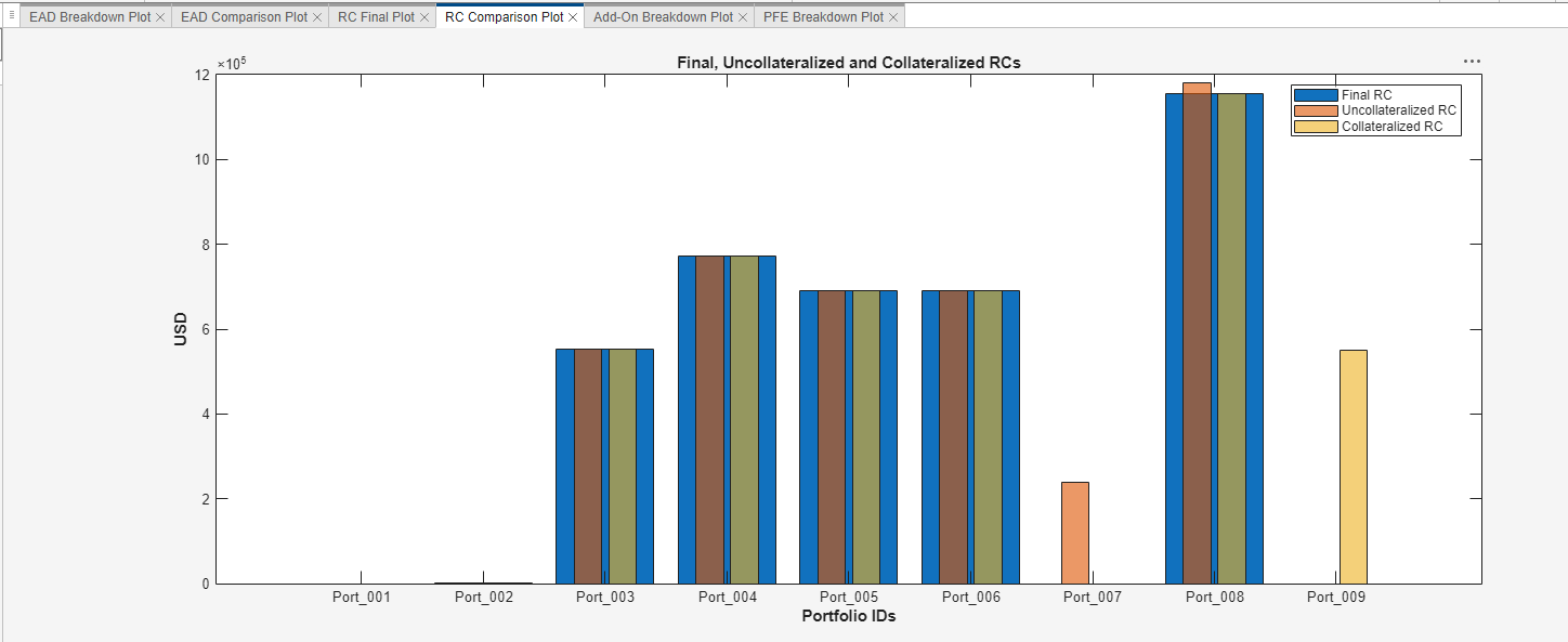
The final RC values are selected between the uncollateralized and collateralized values to minimize EAD.
For more information about RC, see rc and rcChart.
Analyze PFE and Add-Ons
By default, the analysis generates the Add-On Breakdown Plot and the PFE Breakdown Plot. The Add-On Contribution Breakdown Plot displays the aggregate add-on contribution to the portfolio's PFE, including which asset classes make up the aggregate add-on value and how much each of those asset classes contributes.
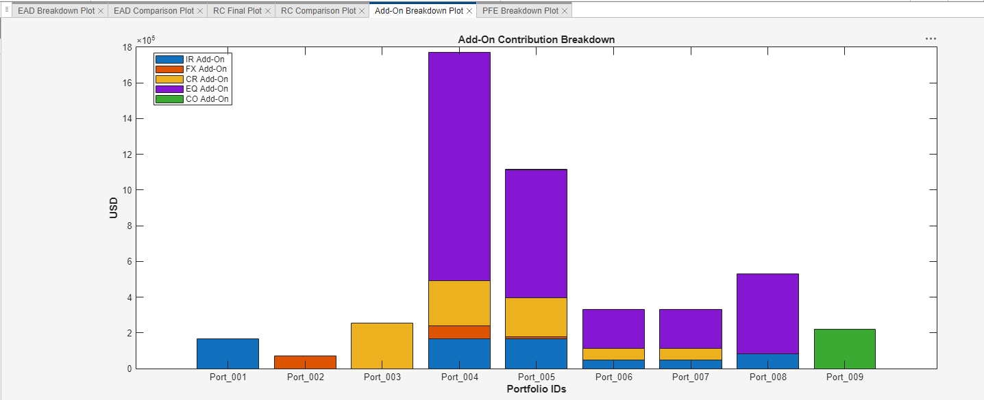
The collateralized and uncollateralized values for the asset class contributions are listed in the Add-On by Asset Class table. The collateralized and uncollateralized asset class amounts are totaled and displayed in the Add-On Aggregate table. The final aggregate add-on values are selected between the uncollateralized and collateralized values to minimize EAD. These final values and their respective asset class compositions are the breakdowns displayed in the Add-On Breakdown Plot. You can add more visualizations for add-ons by using the Plots section of the app toolbar. For more information about add-ons, see addOn and addOnChart.
Add-ons are one of the components used when calculating PFE. In the Uncollateralized PFE and Collateralized PFE tables, the uncollateralized and collateralized aggregate add-on values are multiplied by the uncollateralized and collateralized multipliers, respectively. The products of these components are the respective calculations' PFEs. The final PFE values are selected between the uncollateralized and collateralized values to minimize the EAD. The PFE Breakdown Plot presents both the aggregate add-on and multiplier components that make up the PFE.
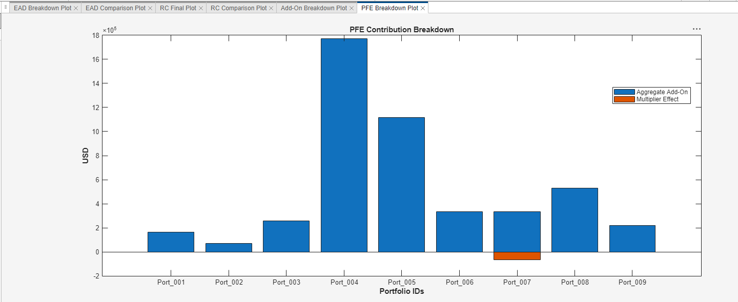
The sum of the multiplier effect and aggregate add-on is the PFE. For more information about PFE, see pfe and pfeChart.
Export Plots, Results, and Data
To export the results to the MATLAB workspace and the plots to MATLAB figures, select the drop-down menu under Export from the app toolbar.
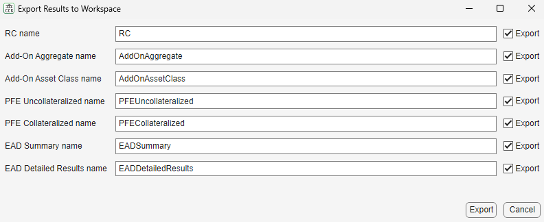
Select Export Results to export results as tables to the MATLAB workspace. Select the results to export. Optionally, you can edit the names of the results. Then click Export.
Select Export Plots to export plots to MATLAB figures. The app exports all of the open plots displayed in the Plots pane in the main window to figure windows. From the figure windows, click Save As and select your desired options in the dialog box to save the figures.
You can also export your results to a saccr object. When you export to a saccr object, the app exports all of the portfolios in the Portfolio Browser pane (even those that are not checked), along with the current settings in FX Spot Rates, Trade Decompositions, and Options, to the new saccr object.
In the export drop-down menu, select Export saccr Object. You can edit the name of the saccr object. Then click Export to create a new saccr object in the MATLAB workspace.