Configure Filter Visualizer
You can use the dsp.DynamicFilterVisualizer object in MATLAB® or the Filter
Visualizer block in Simulink® to visualize the magnitude response and phase response of digital filters.
You can configure the visualizer from the Filter Visualizer interface. These sections
show you how to use the Filter Visualizer interface and the available settings.
Display
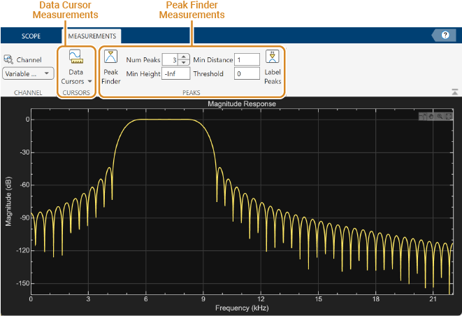
These figures highlight important elements in the Filter Visualizer window in MATLAB.

This figure highlights important elements in the Filter Visualizer window in Simulink.
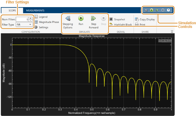
Toolstrip
The toolstrip contains these tabs:
Scope Tab –– Customize and share the Filter Visualizer display.
Measurements Tab –– Control frequency response measurements.
Use the pin button
 to keep the toolstrip showing or the
arrow button
to keep the toolstrip showing or the
arrow button  to hide the toolstrip.
Legend –– When the Filter Visualizer displays multiple filter responses, the scope uses an index number to identify each filter in the legend. For more details on the colors in the legend, see Multiple Filter Names and Colors.
Min Frequency, Max Frequency — The scope sets the minimum and maximum limits of the x-axis using the value of the Range property. To change the frequency range from the Filter Visualizer window, click Settings and set Range or update the
FrequencyRangeproperty in the command line.Min Y-Axis, Max Y-Axis –– The scope sets the minimum and maximum limits of the y-axis using the value of the Y-Limits property. To change the y-axis limits from the Filter Visualizer window, click Settings and set Y-Limits or update the
YLimitsproperty in the command line.Frequency Axis Label –– The scope auto populates this label as Frequency (Hz) or Normalized Frequency (×π rad/sample) depending on whether you select the Normalized Frequency parameter in the Filter Visualizer settings.
Y-Axis Label –– The scope populates this label based on the unit you set in the Display Unit property. To change the display unit from the Filter Visualizer window, click Settings and set Display Unit or update the
MagnitudeDisplayproperty in the command line.Title — You can customize the plot title from Settings or by using the
Titleproperty.(Block only) Simulation Controls –– Control your simulation from the Filter Visualizer window.
Status — Provides the current status of the plot. The status can be:
ProcessingObject –– Occurs after you run the object and before you run the
releasefunctionBlock –– Occurs during simulation.
StoppedObject –– Occurs after you call
release.Block –– Occurs before and after the simulation
ReadyObject –– Occurs after you construct the scope object and before you first call the object.
Block –– Occurs after you open the scope and before you first run a simulation.
PausedBlock –– Occurs when you pause the simulation.
Multiple Filter Names and Colors
When the Filter Visualizer displays multiple filter responses, the scope uses an index number to identify each filter in the legend. To show the legend, on the Scope tab, click Legend. The legend for seven filters, for example, displays as follows.
![]()
By default, the axes background in the scope is black. The scope sets the line color for each filter in a manner similar to the Scope (Simulink) block and in the order shown in this legend.
If there are more than seven filters to display, then the filter visualizer repeats this order to assign line colors to the remaining filters. Colors in the plot repeat in the same order.
![]()
When you change the background to a different color, the scope orders the lines as follows.
![]()
To set the background color, on the Scope tab, click Settings, and then use the Axes color drop-down list to change the background color. To change the line color, first click Line to select a line, and then use the Color drop-down list to change the color of the selected line.
Configure Plot Settings
Use the Configuration section on the Scope tab to modify the plot settings.
Num Filters (block only) –– Number of filter responses to display. You can specify a maximum value of 20.
Filter Type (block only) –– Specify the type of filter response to display as
FIRorIIR. When you chooseFIR, an input port appears for each filter. You can input the numerator coefficients through this port. When you chooseIIR, two input ports appear for each filter. You can input the numerator and denominator coefficients through these ports.The Legend button turns the legend on or off. This button corresponds to the
ShowLegendproperty in the object. When you display the legend, you can control which filters you want the scope to display. To hide a filter from the plot, click the filter name in the legend, the filter name then shows in grey in the legend. To display the filter, click the filter name again. To show only one filter response, right-click the filter name, which hides all other filter responses. To show all filter responses, press Esc. This control is equivalent to changing the Visible parameter in the Scope tab > Settings ( ) > Color and Styling.
The Magnitude Phase button splits the magnitude and phase response of the filter and plots them on two separate axes within the same window. This button corresponds to the
PlotAsMagnitudePhaseproperty in the object.The Settings button opens the settings window, which allows you to modify the sample rate, FFT length, frequency range, x-axis scaling, y-axis label and limits, and signal colors.
Use Filter Visualizer Measurements
Use the Measurements tab to modify the measurement settings. All measurements relate to a specific filter response curve. By default, the scope applies the measurements to the first filter. To change the filter response being measured by the scope, use the Channel drop-down list in the Measurements tab.
Data Cursors

Use the Data Cursors button to display waveform
cursors. You can control the cursor settings from the toolstrip of the scope or
from the command line. For more information on cursor measurements, see the
CursorMeasurementsConfiguration object.
Peak Finder

Use the Peak Finder button to display peak
values for the selected magnitude response curve. Peaks are defined as a local
maximum with lower values present on both sides of the peak. Endpoints are not
considered as peaks. For more information on the algorithms the scope uses to
determine peaks, see findpeaks.
When you turn on the peak finder measurements, an arrow appears on the plot at each maxima and a Peaks pane appears at the bottom of the array plot window showing the x and y values at each peak.
You can customize several of the peak finder settings:
Num Peaks — The number of peaks to show. Must be a scalar integer from 1 through 99.
Min Height — The level above which peaks are detected.
Min Distance — The minimum number of samples between adjacent peaks.
Threshold — The minimum height difference between a peak and its neighboring samples.
Label Peaks — Show labels (P1, P2, …) above the arrows on the plot.
You can control the peak finder settings from the toolstrip of the scope or
from the command line. For more information on peak finder measurements, see the
PeakFinderConfiguration object.
Share or Save the Filter Visualizer
If you want to save the filter visualizer plot for future use or share it with others, use the buttons in the Share section of the Scope tab.
Generate Script –– Generate a script to re-create your filter visualizer plot with the same settings. When you click this button, an editor window opens with the code that you can use to re-create your
dsp.DynamicFilterVisualizerobject.Copy Display — Copy the display to your clipboard. You can paste the image in another program to save or share it.
Print — Open a print dialog box from which you can print the plot image.
Scale Axes
To scale the plot axes, you can use the mouse to pan around the axes and the scroll button on your mouse to zoom in and out of the plot. Additionally, you can use the buttons that appear when you hover over the plot window.
 — Maximize the axes, hide all labels and
inset the axes values.
— Maximize the axes, hide all labels and
inset the axes values. — Zoom in on the plot.
 — Pan the plot.
 — Autoscale the axes to fit the shown data.
Set Additional Properties
You cannot use the Filter Visualizer interface to change properties such as signal
names in the legend and the number of inputs. Set these properties from the command
line using the dsp.DynamicFilterVisualizer object.
See Also
Objects
Blocks
Related Topics
You can also select a web site from the following list:
Americas
- América Latina (Español)
- Canada (English)
- United States (English)
Europe
- Belgium (English)
- Denmark (English)
- Deutschland (Deutsch)
- España (Español)
- Finland (English)
- France (Français)
- Ireland (English)
- Italia (Italiano)
- Luxembourg (English)
- Netherlands (English)
- Norway (English)
- Österreich (Deutsch)
- Portugal (English)
- Sweden (English)
- Switzerland
- United Kingdom (English)